

Web users form opinions within seconds of landing on a website. And while those opinions primarily influence brand perception,research suggests they might also affect trust, purchase intent, and even your web visitors’ likelihood of becoming loyal customers.
So, when aiming to optimize your digital presence for conversions, your website has to be capable of leaving a positive impression on your target audience. And UX design, or, more specifically, design-based cognitive load management, has a huge impact on your ability to reach that goal.
Ultimately, a user-friendly website will not only ensure your prospects have a pleasant interaction with your business (which will, ideally, inspire them to convert). It can also prevent unnecessary experience-related frustrations that might slow down or entirely reduce conversions.
So, if you wish to drive faster conversions, here’s everything you need to know about how to reduce cognitive load across your website. This guide will provide you with practical tips along with real-life examples you can draw inspiration from. Let’s get into it.
Reducing Cognitive Load on Mobile Through Simplified UX Patterns
In 2026, the majority of digital brand interactions happen through small screens.
According to web user behavior research, mobile devices now account for more than 62% of all website traffic worldwide. The number is likely to increase, especially as people’s daily screen time also grows.
Of course, this does not necessarily mean that all of your web visitors will be browsing on handheld devices. But a vast majority might. And it’s your job to ensure they have a pleasant and productive experience while interacting with your business.
Still not convinced that mobile optimization significantly impacts UX? Consider the fact that 30% of web users will stop interacting with a site that doesn’t display well on their device, or that 88% won’t return after a bad experience.
Fortunately, there are plenty of design tactics you can implement to optimize for mobile and reduce cognitive load through simplified UX patterns. For instance, utilizing ample negative space, adhering to standard layout practices, limiting the number of choices, and using clear tap targets are all small adjustments that make a big positive impact on your prospects’ experience.
For example,Spotminders implements all of these UX patterns, creating a fast and intuitive shopping flow. The reduction of on-screen complexity in this manner ensures that users have a pleasant brand experience. Perhaps even more importantly, the brand’s design approach helps visitors make quick decisions, allowing them to complete actions without friction and guiding them through the sales funnel at a faster pace.
Eliminating Uncertainty with Trust Signals and Credibility Cues
Uncertainty is one of the biggest conversion killers that could affect your brand’s ability to acquire new clients. And the reason for this is that it disrupts people’s trust.
Now, if you look into the importance of brand trust in driving conversions, you’ll quickly realize it’s one of the most powerful purchase-affecting factors out there.
According to research, 88% of consumers consider brand credibility equally important as product quality and price. Furthermore, some studies even show that brand trustworthiness reduces price sensitivity and positively affects customer loyalty.
However, the thing is that, even though earning customer trust requires your business to prove its competence and customer-centricity, highly focused UX design can also help you eliminate visitor uncertainty.
By showcasing trust signals and credibility cues, you won’t just inform your target audience’s perception of your business (guiding them to see your brand as a reliable industry authority). Much more importantly, using trust elements and credibility cues prevents your prospects from questioning your trustworthiness in the first place, effectively reducing their cognitive load and driving faster purchase decisions.
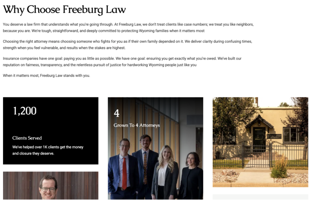
For a great example of how you can achieve this effect on your website, check out Freeburg Law. This brand showcases credentials, clear positioning, and reassuring messaging to reduce uncertainty for high-stakes customer decisions. This approach helps the business’s prospects feel safe and confident, making them less likely to encounter doubts that could stall them within the buyer’s journey or cause them to abandon the brand altogether.
Reducing Choice Overload on Key Conversion Pages to Speed Up Decision-Making
Offering web visitors too many options is one of the most commonly overlooked causes of low conversion rates on websites. Not because an abundance of choice is inherently bad. However, too many possibilities cause web users to become overwhelmed and cognitively fatigued.
The psychological term that explains this phenomenon is choice overload (overchoice). Essentially, when they have too many products to pick from, buyers begin to experience mental overwhelm, which slows down their decision-making abilities, reduces focus, increases stress, and, in some cases, even causes them to leave the buyer’s journey altogether.
With this in mind, one of the most effective methods to boost website conversions is to design an easier decision-making process for your prospects. How? You can easily do this by reducing choice overload on key conversion pages.
Essentially, this boils down to a few basic UX design upgrades.
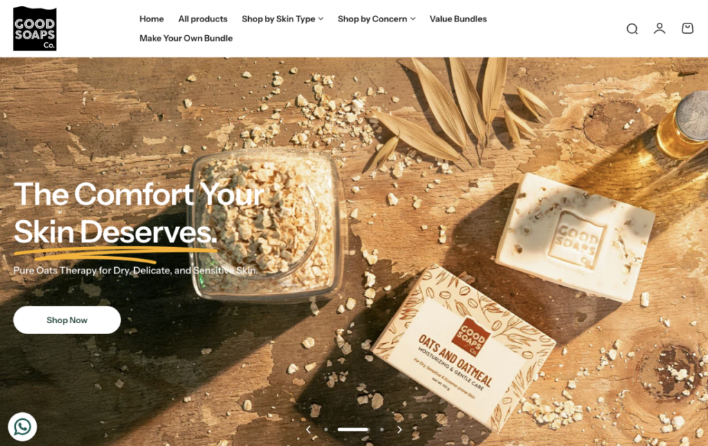
For instance, you can choose to only showcase some of your products on landing pages. You can reduce the number of CTAs on your homepage. Or, you can try not to use too many web elements that compete for your target audience’s attention.If you check out Good Soaps, you’ll notice that this brand employs a highly minimalistic approach to design, which guides visitors towards a single chosen action/product. Sure, the brand doesn’t manage to highlight all of the items in its inventory. Nevertheless, by reducing choice overload, it effectively funnels awareness-stage leads into the evaluation and conversion phases of the buyer’s journey, automatically increasing their chances of converting on their first visit (instead of allowing them to become overwhelmed).
Designing Homepage Messaging That Communicates Value in Seconds
Did you know that consumers have minimal patience for brands that don’t immediately show they have a solution to their unique needs? According to new research,most people actively ignore branded messaging that doesn’t relate to their pain points, while 96% say that personalization (or at least relevant messaging) makes them more likely to convert.
So, if you wish to reduce cognitive load and encourage your target audience to make purchase decisions sooner rather than later, consider optimizing your homepage messaging. Ideally, it should be capable of communicating value in seconds and doing so in a way that makes it crystal clear why buyers should choose your solutions.
A good rule of thumb when producing conversion-inspiring website copy is to aim for directness. Don’t just address your ideal customers’ needs – be very direct about how your products or services can solve those needs.
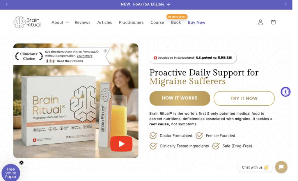
For instance, you can check out how Brain Ritual accomplishes this on its homepage. This brand uses super clear, benefits-oriented messaging that directly communicates the product’s value, without distractions. Yes, there is plenty of information further down the page about how the product manages to provide the benefits it promises. But for first-time web visitors, the core value of the solution is instantly clear, preventing them from becoming overwhelmed by too much information or, worse yet, confused by a bunch of medical jargon they don’t comprehend.
Optimizing CTAs to Be Instantly Understandable and Easy to Act On
In some cases, the best method to reduce cognitive load isn’t to make changes to your web copy or any other aspect of your on-site content. Instead, it’s to pave a clear path for your target audience that will guide them toward the pain-point resolution they seek.
The easiest way to do this is to optimize your calls to action.
By making these web elements instantly understandable and easy to act on, you will effectively boost conversion rates and shorten the time frame it takes for prospects to move from the awareness to the purchase stage of the buyer’s journey.
So, what are some of the best tactics for increasing the attractiveness and persuasiveness of your CTAs?
In addition to ensuring they stand out in your design through color and contrast, it’s also important to use direct, concise language that effectively explains the outcomes web visitors will attain by clicking them. Furthermore, it’s a good idea to support CTA buttons with trust-building microcopy, especially in settings where consumers have a high level of risk perception or if they’re still unsure that your product is the right choice for their needs.
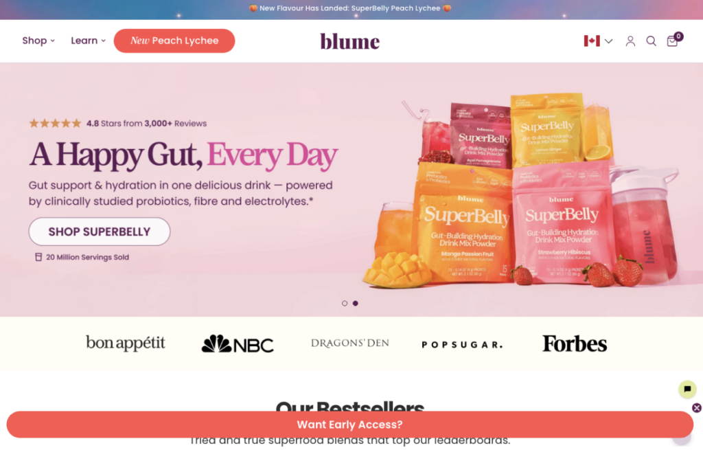
For example, the Blume homepage uses traditional CTA buttons to encourage visitors to shop, and they work great. However, the site also features a lead-generation CTA, which is an amazing example of what optimization can do for guiding prospects through the sales funnel. By telling web visitors that they can get early access to a new product, Blume expertly generates hype around its new release, increasing its audience’s purchase intent and maximizing their chances of becoming newsletter subscribers by creating a system that makes the new release an exclusive product that can only be bought by a specific audience segment and only as part of a set.
Structuring Content Layouts for Easy Scanning and Quick Understanding
Lastly, when it comes to reducing cognitive load across your website, especially when aiming to drive faster conversions, keep in mind that too much text can easily lead to cognitive fatigue. So, by ensuring your content’s readability, you can make it easier for your audience to extract value from your website. Furthermore, by structuring pages in a way that allows skimming and scanning, you can support visitors’ learning process, which will automatically lead to better product understanding and higher purchase intent.
With this in mind, experiment with tactics to optimize your content for reduced cognitive load.
One approach would be to focus on the text itself, which is super simple with freely available readability tools, such as Grammarly or Hemingway. Alternatively, you can focus on implementing the right content layouts, as they can also aid with comprehension.
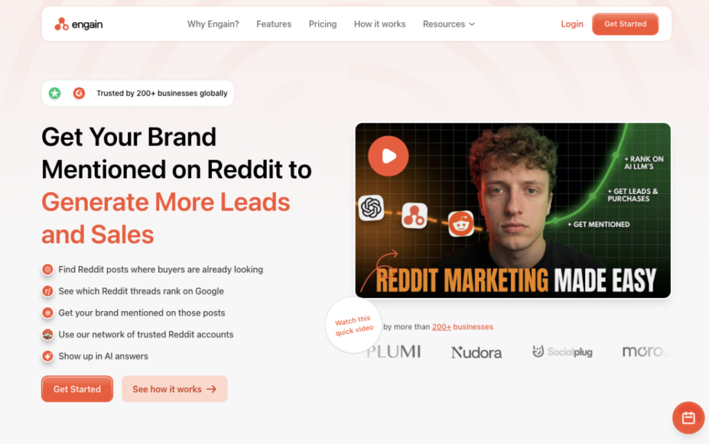
For example, if you check out Engain, you’ll notice that this brand organizes on-page content into clear, scannable sections. The fact that each of these blocks is short effectively prevents cognitive fatigue for readers. However, the headings and visual separation also aid UX by making it easy for visitors to scan the page for information relevant to their specific needs. The combination of these approaches creates a setting where prospects can quickly grasp a complex solution, making them far more likely to recognize its value without being forced to read the entirety of the page word-for-word.
Final Thoughts
The secret to great web design isn’t just aesthetic appeal. Functionality, specifically, user-centric functionality, is just as essential for driving conversions. And if your goals consist of shortening your sales cycles and encouraging your prospects to click the “Buy” button sooner rather than later, then you might want to work on reducing cognitive load.
The tips outlined in this guide are all excellent strategies for preventing web visitors from getting overwhelmed. They allow you to create a clear and focused browsing experience. And they’re all sure to encourage your leads to convert. So, give them a try and see how they serve your needs. You might just find they’re the missing secret ingredient you needed to elevate brand growth.