
Landing pages live and die by one thing: how easy they are to use.
When visitors arrive on your page, they’re making split-second decisions. A confusing layout, a form with too many fields, or a slow load time can send them away before they ever read your offer. That’s friction, which is a main obstacle to conversions.
The good news is that most friction on landing pages is usually a handful of UX mistakes that repeat across industries. Fixing them is quite straightforward if you know where to look.
With that in mind, we’ll walk through practical ways to identify and remove the friction points that push visitors away. Whether you’re building a landing page from scratch or improving an existing one, these UX principles will help you create a smoother path from click to conversion.

Communicate Value Instantly with Above-the-Fold Messaging
Your visitors won’t scroll to find out what you do. If your headline and subtext don’t answer their core questions within seconds, they’ll leave.
Above the fold (everything visible before scrolling) is where your landing page either earns attention or loses it.
What to include above the fold:
- A clear headline that states exactly what you offer. Skip the clever tagline if it sacrifices clarity.
- A supporting subheadline that fills in the key details – who it’s for, how it works, and what it costs, if pricing is a trust signal in your niche.
- A single, visible CTA that tells visitors what to do next without making them hunt for it.
- Trust indicators like certifications, reviews, or credentials, placed close to your headline, where they’ll actually be seen.
- Avoid vague language. Phrases like “We’re here for you” or “Solutions for every need” tell visitors nothing.
- Be specific about what you offer, who you serve, and what they get.
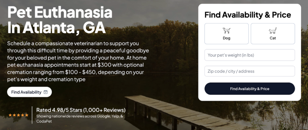
If you want to see how this works in the real world, take a look at CodaPet. This company operates in a deeply sensitive niche, bringing licensed veterinarians into people’s homes to help families say goodbye to their pets peacefully. This is an emotionally charged service where trust and clarity aren’t optional.
Their city-specific landing pages, like the one for pet euthanasia in Atlanta, get this right immediately. The header text tells visitors exactly what the service involves, confirms that a qualified vet will be present, emphasizes the comfort of a home setting, and lists starting prices upfront, including cremation options.
This way, visitors get everything they need to decide whether to book, right where they land.
Reduce Cognitive Load with Scannable Structure
Most visitors don’t read web pages. They scan them while looking for the piece of information that confirms they’re in the right place. If your layout makes that harder than it needs to be, you’re adding friction before the visitor even reaches your offer.
Pages that align with expected design conventions (clear headings, logical flow, and organized sections) generate significantly better user attitudes. This concept, known as webpage prototypicality, shows that familiar structure is highly effective.
Here’s how to make your landing page easier to scan:
- Use descriptive headings that tell visitors exactly what each section covers. Headings shouldn’t be clever. They should be clear.
- Break up long text into short paragraphs of two to three sentences. Dense blocks of copy push visitors away.
- Prioritize content hierarchy by placing your most important information first within each section, not buried at the end.
- Use whitespace deliberately to separate ideas and give the eye a natural path to follow.
- Avoid sidebar clutter or competing elements that pull attention away from your main message.
The goal is a page where visitors can find what they need without having to work for it.
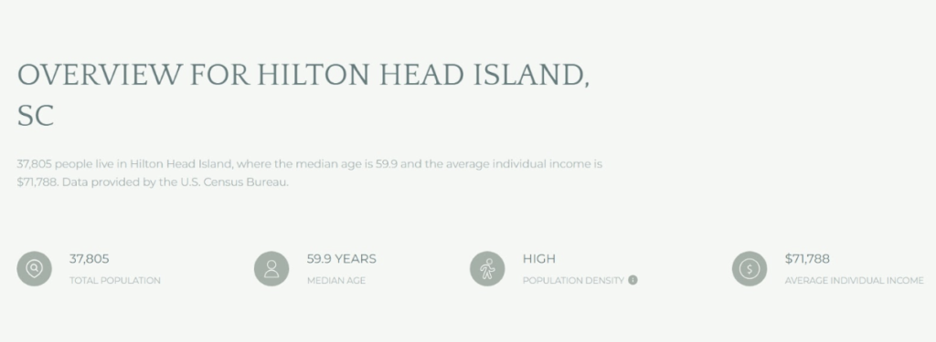
John Campbell works in the competitive world of real estate, where location-specific detail matters enormously to buyers and sellers.
His Hilton Head Island page handles a high volume of local information without overwhelming the visitor. Each section leads with a prominent, descriptive headline that immediately signals what’s ahead.
This allows visitors to scan the page, jump to what’s relevant to them, and absorb the content at their own pace.
Use Visual Hierarchy to Guide Users Toward Action
Not all content on your landing page carries equal weight, and your design should reflect that. Visual hierarchy is how you control where visitors look first, second, and third, and ultimately, where they click.
Without it, every element on the page competes for attention equally, and visitors end up doing the work of figuring out what matters.
Here’s how to build visual hierarchy into your landing page:
- Size signals importance. Your headline should be the largest text on the page. Subheadings come next, followed by body copy. Don’t let supporting text compete with primary messaging.
- Use contrast strategically. High-contrast CTAs (buttons that stand out from the background) naturally draw the eye. If your CTA blends in, it’ll get ignored.
- Direct attention with imagery. People follow the gaze of faces in photos and the direction of visual cues like arrows or angled lines. Place these elements near your CTAs or key messages.
- Create clear sections. Distinct, well-separated content blocks give the page a logical flow. Visitors should be able to move from one section to the next without losing their place.
- Limit competing focal points. Every page should have one primary action you want visitors to take. Design everything else around supporting that action.
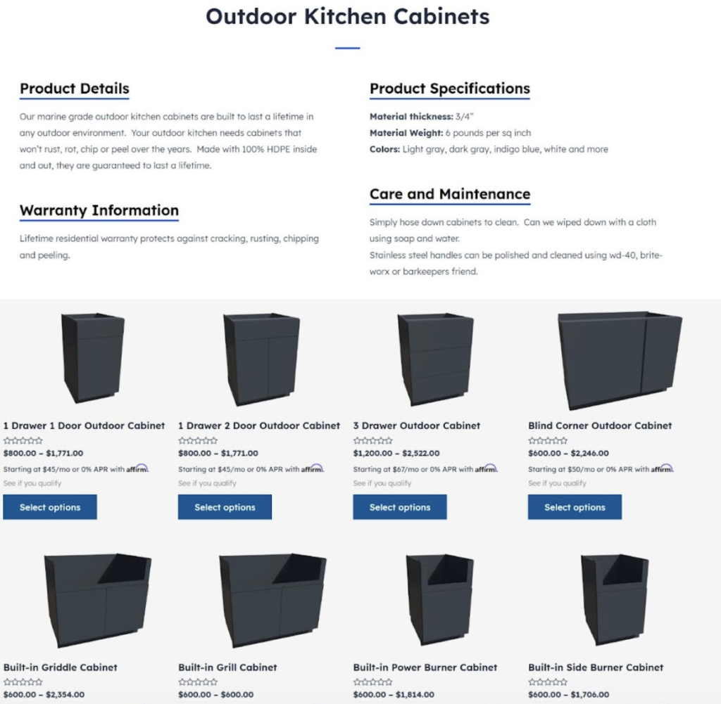
EXT Cabinets sells weatherproof outdoor kitchen cabinetry built to handle the elements, a product that benefits from strong visual presentation.
Their HDPE outdoor kitchen cabinets page puts this method into practice effectively. High-quality imagery, deliberate sectioning, and a well-organized layout work together to move visitors through the page naturally. That way, key information surfaces at the right moments.
This structure consistently points users toward the next step without any one element feeling forced or out of place.
Match Messaging to User Intent
When visitors land on your page, they arrive with a specific question or need already in mind. If your messaging doesn’t reflect that immediately, there’s a disconnect. That creates friction.
The closer your content matches what a visitor was expecting when they clicked, the more likely they are to stay and convert.
The numbers support this: Personalized, intent-matched messaging can drive conversion rates up by as much as 40%. That’s not a small lift, and it comes down to making visitors feel like the page was built specifically for them.
Here’s how to align your messaging with user intent:
- Start with your traffic source. Someone clicking a Google ad has different expectations than someone coming from a social post. Tailor your headline and subtext to match what they were searching for or responding to.
- Segment by audience where possible. If you serve multiple types of customers, consider separate landing pages for each segment rather than one generic page trying to speak to everyone.
- Mirror the language your audience uses. Pull phrasing directly from customer reviews, forums, or support tickets. When visitors read words they’d use themselves, the page feels relevant.
- Address the specific problem they came to solve. Lead with their pain point, then present your solution.
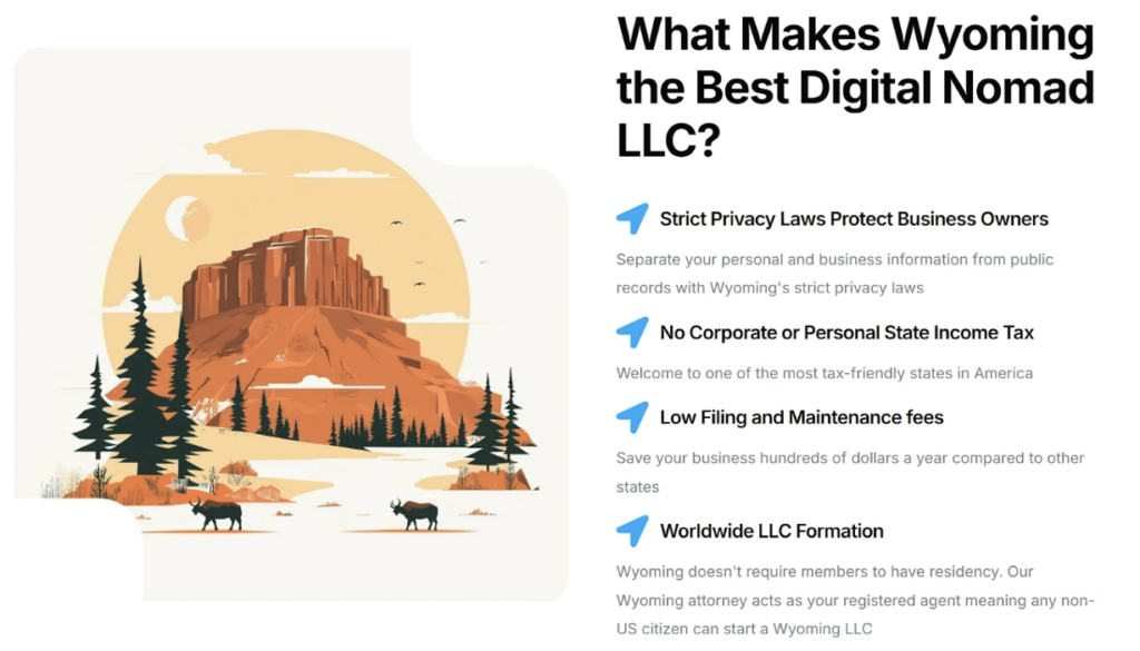
The company Start in Wyoming offers a strong example. The brand provides Wyoming LLC formation and registered agent services for entrepreneurs.
Their landing page discussing LLCs for digital nomads shows how intent-matched messaging is done. Rather than pushing a generic LLC pitch, the page speaks directly to the priorities and lifestyle of location-independent workers.
The content addresses their specific concerns, making the whole experience feel tailored rather than broad.
Reinforce Trust at Key Decision Points
Visitors don’t convert the moment they understand your offer. They become customers when they trust it. That distinction matters because trust isn’t built once at the top of the page and carried through. It needs reinforcement, especially at the moments where hesitation is most likely to creep in.
Those moments are predictable. It’s usually needed just before a form, after a pricing reveal, or following a feature list where visitors shift from curious to hesitant.
Here’s how to place trust signals where they’ll do the most work:
- Position testimonials after feature sections. Once visitors understand what you offer, a real customer confirming it works closes the loop effectively.
- Make testimonials specific. Vague praise like “great service” carries little weight. Outcomes, timelines, and concrete results are far more convincing.
- Add credibility to the source. A testimonial with a full name, photo, job title, and company is significantly more believable than an anonymous quote.
- Use trust badges near CTAs. Security seals, certifications, and guarantees placed close to your action button reduce last-second hesitation.
- Let some testimonials describe the experience, others the outcome. Mixing both gives a fuller, more credible picture.
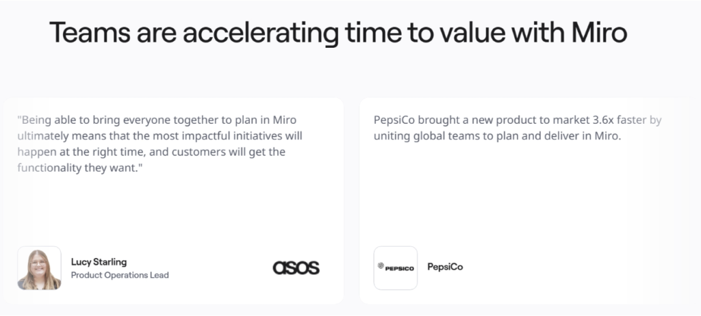
A brand that does this correctly is Miro. This company offers an online whiteboarding platform that teams use to brainstorm, plan, and build together.
On their product acceleration landing page, Miro places client testimonials directly after their feature showcase. Each testimonial includes the client’s photo, name, company, and role. These are details that make the source verifiable and credible.
Some testimonials capture what clients said directly, while others focus on measurable outcomes. Together, they address both emotional and rational concerns at exactly the right moment.
Eliminate Distractions to Stay Focused
Every element on your landing page asks something of your visitor’s brain. A logo, a navigation menu, an animated banner, a pop-up – each one pulls a small amount of attention. Add enough of them, and you’ve created a page that’s exhausting to process, even if the individual elements seem harmless on their own.
There’s a cognitive reason for this. Poorly designed presentation creates an extraneous load that overwhelms working memory, leaving visitors with less mental capacity to focus on your actual message. The result is confusion, hesitation, and drop-off.
Here’s how to cut the clutter from your landing page:
- Remove the main navigation. Landing pages aren’t websites. A full nav menu gives visitors an easy exit and pulls focus away from your single goal.
- Limit your CTAs to one primary action. Multiple competing buttons create decision paralysis. Pick one action and design the page around it.
- Strip out decorative elements that don’t support your message. If it’s not earning its place, it’s adding noise.
- Use whitespace intentionally. Space between sections, around text, and near CTAs makes content easier to process and gives the page a clean, focused feel.
- Avoid autoplay video or animations that activate without user input. Motion draws attention instantly and often away from where you need it.
An excellent example here is MailerLite, an email marketing platform that helps businesses build campaigns, automate workflows, and grow their audiences.
Their email automation landing page keeps things deliberately minimal. Generous whitespace surrounds each element and separates every section, so nothing feels crowded or rushed.
This allows features and benefits to stand on their own clearly, so visitors can move through the page without sorting through visual noise to find what matters.
Final Thoughts
Reducing friction on landing pages often comes down to clarity and structure. Visitors should understand the value of your offer quickly, navigate the content easily, and feel confident about the next step.
When pages remove confusion and limit unnecessary effort, users stay engaged and move toward action with fewer obstacles.
The strategies covered here focus on practical improvements. Each tactic supports the same goal: Making the experience simple for the user.
Brands that evaluate their landing pages through this lens often discover small adjustments that produce meaningful improvements in engagement and conversions. A thoughtful UX approach turns landing pages into straightforward paths from interest to action.