


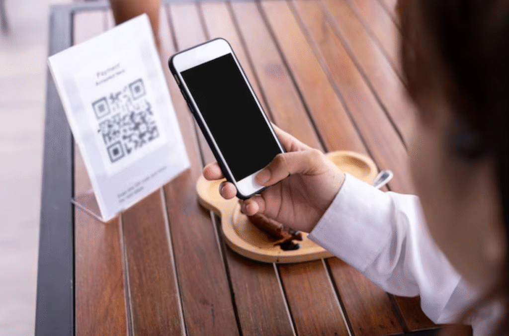
For years, QR codes carried a purely functional reputation. They were black, square, and unapologetically technical. You scanned them, you moved on. There was no expectation that they would match a brand’s aesthetic or contribute to visual identity.
That perception has changed.
Today, QR codes appear on premium packaging, fashion lookbooks, restaurant menus, event invitations, and B2B proposals. In many cases, they’re not just utilities—they’re part of the design. The difference lies in how they are created.
Moving Beyond the “Black Square” Look
The traditional black-on-white QR code works because it offers maximum contrast. But that doesn’t mean it’s the only option. Modern design tools allow brands to adapt QR codes to their visual language without compromising functionality.
Color is the first and most impactful transformation. Instead of default black, businesses can use deep navy, charcoal, forest green, or other brand-aligned tones. Backgrounds can shift from plain white to subtle neutrals, soft pastels, or textured layouts.
For example, a wellness brand may use muted earth tones to align with its packaging. A tech startup might opt for a sleek gradient in blue and violet to reinforce innovation. A luxury brand could use monochrome minimalism—dark gray on ivory—for understated elegance.
The key principle is contrast. The code must remain clearly readable by a smartphone camera. Design should enhance perception, not interfere with scanning.
Softer Shapes Create a More Human Feel
One reason QR codes look “technical” is their sharp geometry. Perfect squares and rigid corners give them a mechanical appearance. Switching to rounded modules or softer dot patterns instantly changes the emotional tone.
Rounded QR patterns feel more approachable. They integrate naturally into lifestyle brands, hospitality environments, and creative industries. Even subtle adjustments to the corner “eyes” of the code can create a cohesive look that feels intentional rather than generic.
These small visual refinements transform the QR code from a barcode-like utility into a graphic element that belongs in the layout.
The Power of Gradients and Subtle Styling
Gradients have become common in modern branding, and QR codes can adopt this trend—carefully. A well-executed gradient can add depth and dimension, making the code visually engaging without overpowering it.
For instance, a blue-to-teal gradient works beautifully for digital products. A coral-to-rose blend can soften the look for event materials or invitations. The critical rule remains the same: maintain strong contrast throughout the transition.
Gradients should never sacrifice clarity. A beautiful design that fails to scan defeats its purpose.
Logo Integration Builds Trust
One of the most effective ways to remove the “technical” feel is by adding a logo to the center of the QR code. A logo instantly signals ownership and credibility.
When customers see a branded QR code on packaging or a presentation, they are more likely to trust it. It feels deliberate, not random. Restaurants often embed their logo in menu QR codes. Agencies include their emblem in proposal materials. Product packaging frequently features logo-centered codes linking to instructions or tutorials.
Balance is essential. The logo should be proportionate and positioned so that enough scanning structure remains intact. Proper spacing ensures the design remains both attractive and functional.
Framing the Experience
Context matters. A QR code placed abruptly on a layout can feel disconnected. Adding a subtle frame or call-to-action text integrates it into the communication.
Phrases like “Scan to Explore,” “View the Collection,” or “Access the Guide” clarify purpose. The QR code becomes part of the storytelling instead of an unexplained technical object.
In retail, framed QR codes on shelf tags guide shoppers to product demonstrations. In corporate proposals, they link to detailed case studies without overcrowding slides. In event invitations, they connect guests to digital photo albums or schedules.
Creating design-forward QR codes requires flexibility.
GeneratorQR delivers that flexibility without compromising scan reliability, positioning itself as a powerful custom qr code generator for brands that value both aesthetics and performance. The platform enables users to customize colors, apply gradients, switch to rounded patterns, refine eye styles, and add logos—all within a clean, intuitive interface built for clarity.
High-resolution export options make the codes suitable for both digital use and large-format printing. This is particularly important when QR codes are integrated into packaging, signage, or premium marketing materials. Instead of looking like a technical add-on, they become part of the visual system.
GeneratorQR helps bridge the gap between function and design—allowing businesses to create QR codes that feel cohesive, branded, and modern.
Design That Invites Interaction
A QR code should not feel like a technical interruption. It should feel like an invitation.
When thoughtfully designed—with balanced colors, softened shapes, brand-aligned logos, and contextual framing—a QR code becomes a natural extension of your visual identity. It no longer sits awkwardly on the page. It belongs there.
In a world where physical and digital experiences constantly overlap, the design of entry points matters. A well-crafted QR code doesn’t just connect people to content. It communicates professionalism, intention, and attention to detail—before anyone even scans it.