Instagram ads are in a league all their own. Since the platform is so different from Facebook, you might feel stuck trying to find Instagram ad example inspiration. As a highly visual platform, Instagram allows you to be really creative with your ads. However, it can be tough to know where to start with so many possibilities. Instagram’s audience is made up of over 1 billion monthly active users, so it’s important to nail down your ad strategy.
Fear not, we’re sharing some of our favourite Instagram ad examples with you and providing you with some actionable tips to help you generate huge growth with your own Instagram ads.

Here at K6, we have tons of experience with Instagram ads and even more with Instagram ad examples. Don’t hesitate to reach out to us if you need any help. Also, if you like this article, we recommend checking out our other articles on Facebook ad examples and LinkedIn ad examples.
Let’s get into it!
1. The New Yorker – Still Image
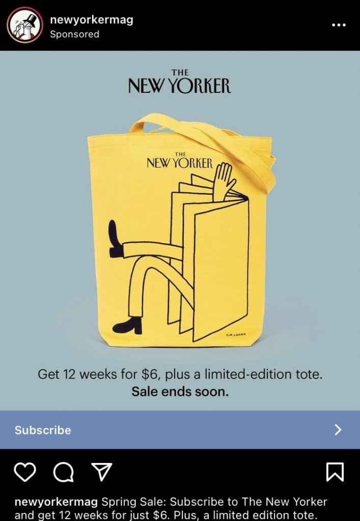
This ad from The New Yorker is a great addition to our Instagram ad examples list because of their use of a freebie. Even more enticing is their choice of copy – adding a “limited-edition” caveat to a product makes it instantly more coveted. It’s a great way to highlight the products and add a sense of urgency to checking them out… people don’t want to miss out on an exclusive product.
Bright colours also work well in this ad. The yellow is super noticeable and draws attention to the bag, as it stands out in contrast against the blue background.
2. Febreze – Video

Febreze shows off their new Light line of scents by making them appear to be floating. We love this Instagram ad example because it really illustrates the message of the ad.
Their choice of copy highlights “no heavy perfumes”, and the motion plays with that idea in a fun and creative way. They’ve also used consistent colours to communicate the scents and feelings they’re trying to evoke with their sprays and products.
3. Adobe Creative Cloud – Still Graphic
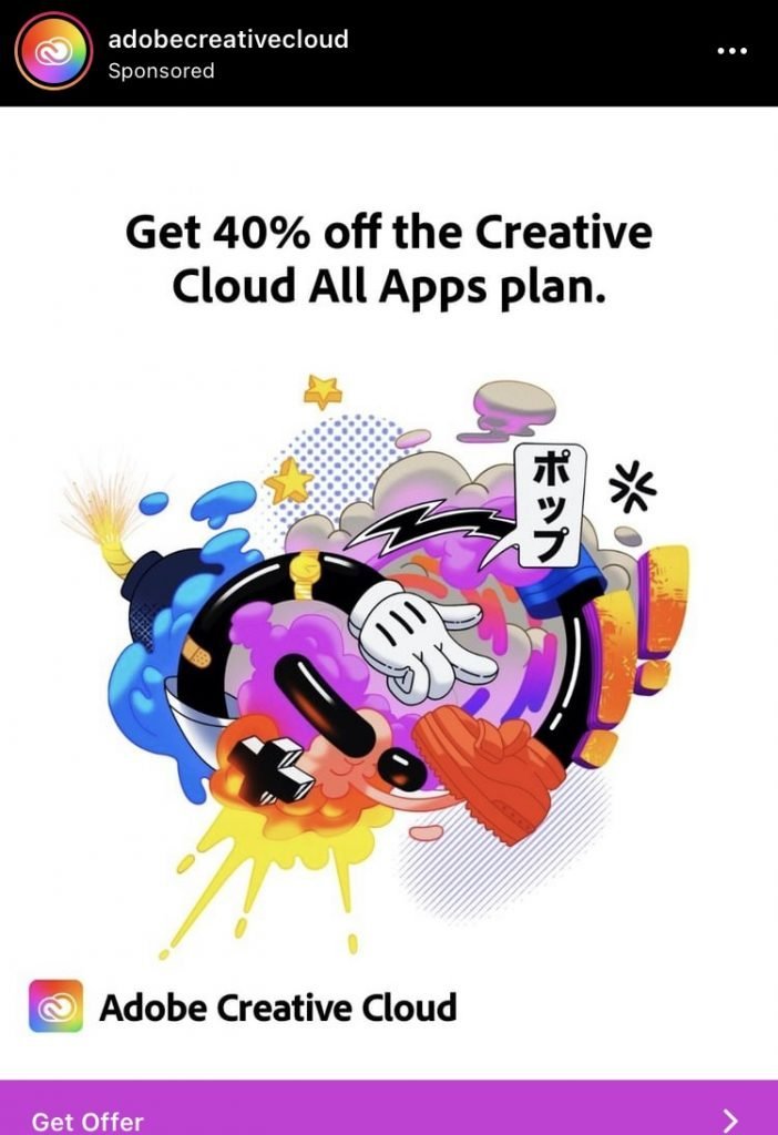
A dynamic and creative design is what you’d expect from an Adobe ad, and they definitely deliver. This works so well because it shows the possibilities of what you can creative using the Adobe Creative Cloud. They’ve chosen bright colours to contrast against the stark white background, as well as the Instagram feed (as long as you’re not in dark mode like me… whoops!).
What’s more, they’re offering a super deal in this ad. In simple terms, the ad copy makes it clear that this is a great offer. Specifying a percentage off or $ amount saved is a good way to get your ad noticed. It’s great to say you have a deal, but it’s even better to tell customers how much they’ll save.
4. Dispatch Coffee – Still Image
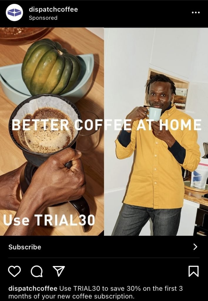
How does it get any better than a fresh cup of coffee brewing in the morning? We love this Instagram ad because it’s simple but highly effective. Dispatch Coffee does a great job of making us want to start up the kettle by using high quality imagery.
The copy is clear and to the point and they offer a high value discount code to try their subscription services. Offering coupon codes on sites like Bountii is an excellent way to convince new customers to come aboard. Additionally, the product that they’re selling is a subscription. That’s another great way to turn first-time purchasers into loyal customers.
5. The Fab Story – Still Graphic
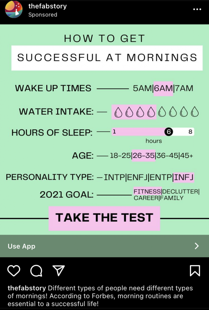
People love interactive posts and quizes, and The Fab Story has taken advantage of that by creating a fun test for users to consider. This is a great way to get users to stop and think. They might consider their own needs and realize that your services can really help them.
Another great way to grab an audience’s attention is through colour. Look for high contrast colours that make your message stand out.
6. Good Food – Still Graphic
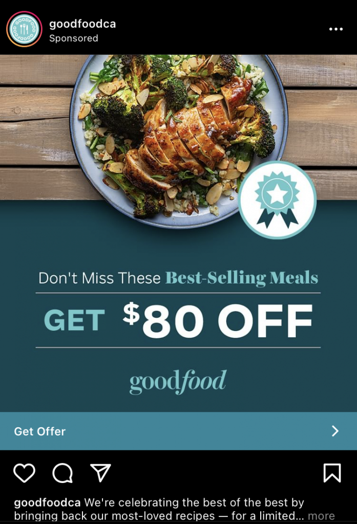
Good Food is giving us a lesson in consistent branding with this great Instagram ad example. Their brand colours include shades of blue and this ad is unmistakably theirs.
They’ve also included a high value offer, and they’ve done it by telling customers how much money they’ll get off with their order. This is one of the best ways to pull people in because they don’t have to guess how much they’ll save! Plus, their food looks delicious.
7. Balance – Still Graphic
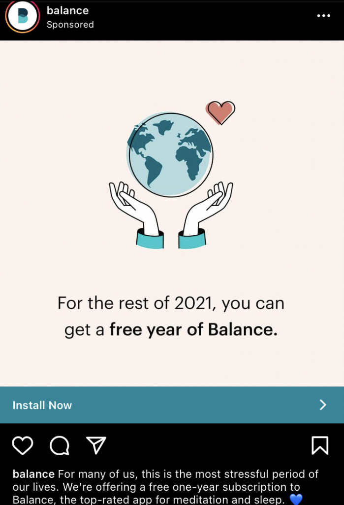
2021 is definitely a good year for a free one-year subscription to a meditation and sleep app, and Balance has seized an amazing marketing opportunity here. This Instagram ad is a great one because it speaks to pretty much all of us right now.
A full year for free is a pretty amazing deal, too. It’s the kind of deal that makes you curious to check out the app… because it’s free! The customer has nothing to lose.
8. Jenny Bird – Still Image
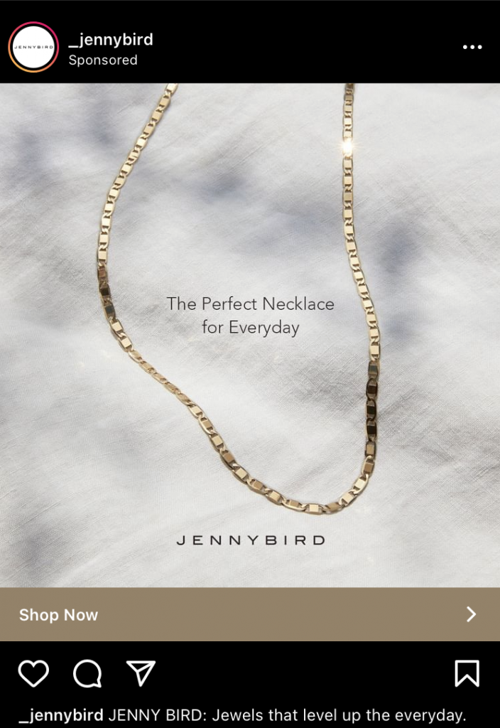
This Instagram ad is super simple, and it works extremely well for Jenny Bird. They’ve included their logo to help with brand recognition. Because the ad is so simple, it’s hard to miss the logo. Additionally, they’ve kept the colours relatively monotone, so it doesn’t distract from the necklace and copy on the image.
As a jewelry brand, it’s essential to show off their products in the best light possible. The necklace sparkles in this image and shows customers how shiny it is – synonymous with high quality.
9. SONOS – Still Graphic
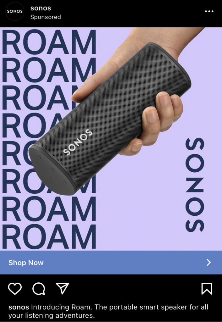
Repetition is an awesome way to communicate the message that you’re trying to convey – in SONOS’ case, they’ve done a great job of introducing their new speaker. In addition, they’ve also used different tones of purple to keep the ad consistent and appealing. Against the purple background, the speaker stands out.
Since their speaker is portable, it was also a great choice to show the product in someone’s hand. This way, we can see exactly how portable it is!
10. Pela – Still Image
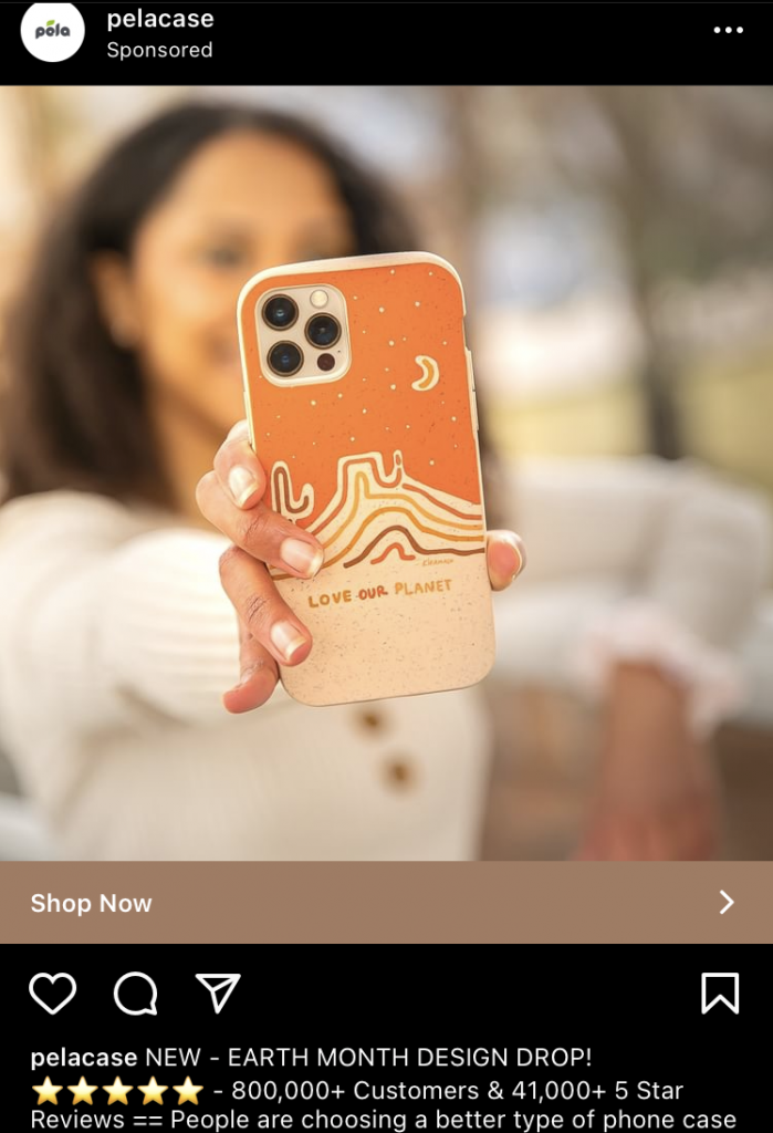
Reviews are a super good way to earn some credibility, so show them off in your ads. It’s an especially good technique if you’re hoping to reign in some new customers and introduce them to your brand.
Because Pela is such an eco-conscious brand, it makes perfect sense for them to take advantage of Earth Month. Take note of events like this and if they fit with your brand identity, use them as an opportunity to promote a sale or an exclusive design drop.
11. Dawn – Video
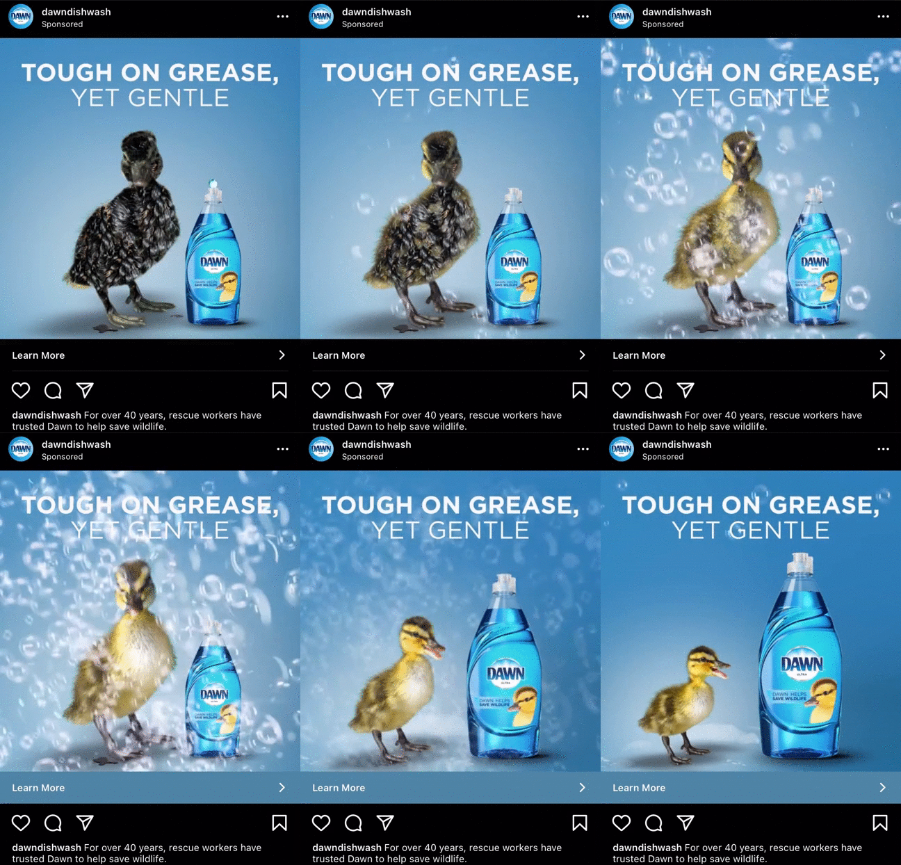
Who doesn’t love cute little ducklings? Dawn knows that they can tug on some heartstrings with this ad, and it does a great job. Saving wildlife is a project that Dawn has been involved with for years, so the action of the duck being cleaned with Dawn helps strengthen their brand recognition. We love the metaphorical nature of this signature advertising technique of theirs. A soft fluffy duck shows just how gentle their product is.
Additionally, the copy works to strengthen trust and credibility for the brand. Over 40 years of helping save wildlife is a super feat.
12. WebFlow – Video
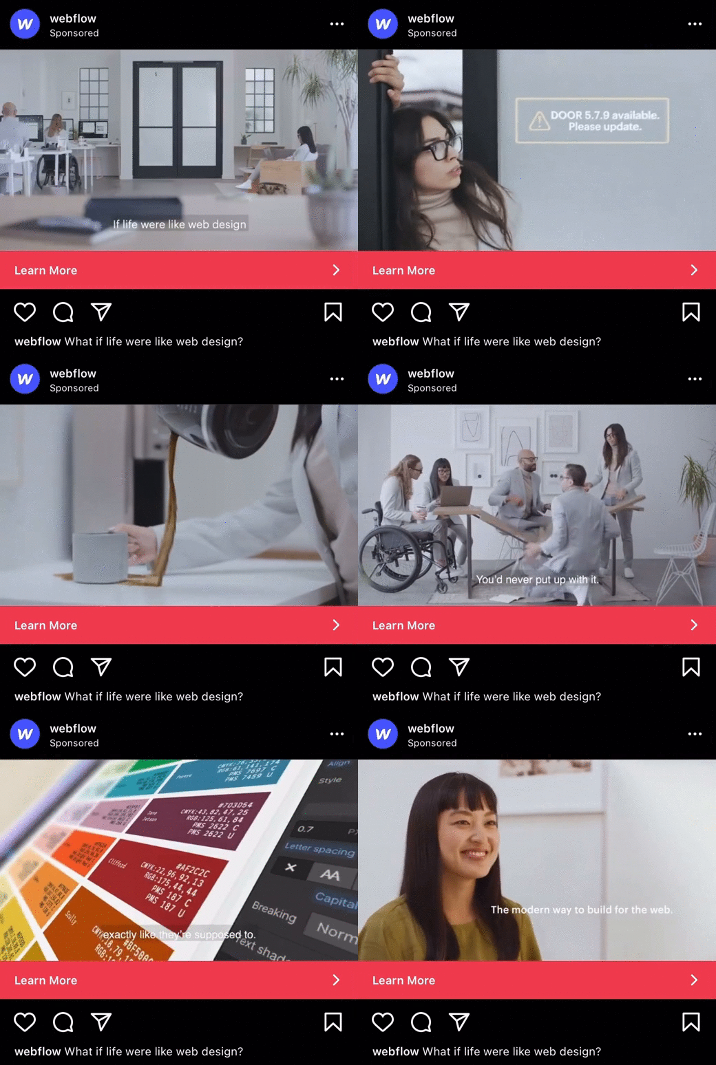
This ad is super creative, which bodes well for a web design platform. It tells an interesting story, presents an issue in a fun way, and then offers a solution – their their Webflow development services.
The story is metaphorical, which is especially important for customers who may not fully understand web design. This way, customers understand the need for Webflow‘s services. They’ve also played with colour in smart way to help illustrate the metaphor. When they show life if it were like web design, colours are subdued and bland. When they show Webflow, colours are vibrant.
13. Calm – Video
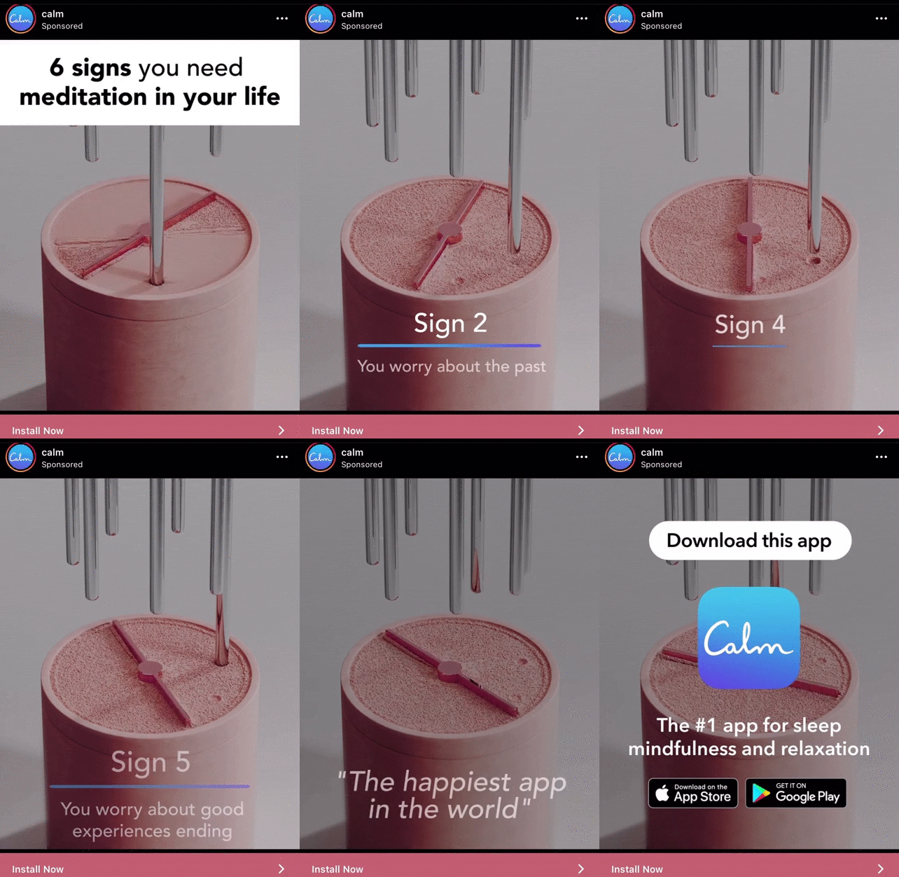
Did this ad make you feel calmer? That’s the point! This Instagram ad from Calm is great because it shows the product in action by giving you a taste of what their app experience is like. It’s almost as if you’re getting a free trial of their services.
The copy in the ad is also highly effective. It speaks directly to you and it identifies issues, to which it offers a solution: downloading the app.
14. Leadpages – Still Graphic
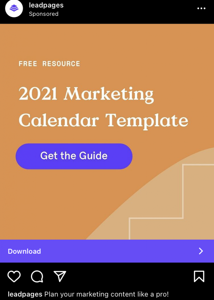
Leadpage’s Instagram ad made the cut for this list because of their smart use of contrast between orange and purple. The purple colour serves two purposes, to stand out in contrast of course, and to reinforce the brand. Leadpage’s branding includes purple, so highlighting the call to action in purple strengthens their brand identity.
Another great way to create successful ads is to offer a free resource in return for a lead. Here, Leadpage do that by making a marketing calendar template available for download. People are more apt to give you their information if they feel they’re also getting something of value out of it.
15. Hello Fresh – Still Graphic
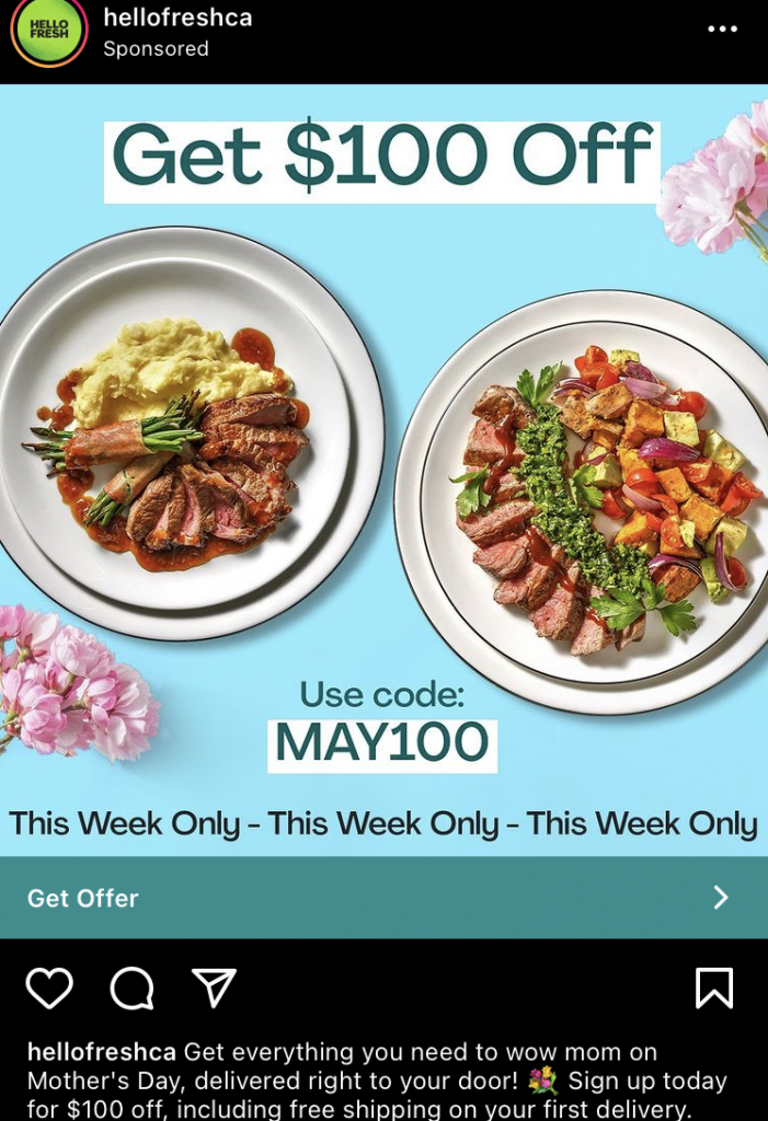
Hello Fresh is advertising a great deal on Instagram, and they’re doing it in 3 super effective ways. First, they’ve clearly outlined a high value deal in large, highly visible font. You want to make sure that customers immediately recognize your deal.
Second, they’ve used a promo code. Promo codes are an awesome way to pull in new customers and give them an exclusive deal that they can only access with your code.
And finally, they’ve used ad copy to explain the limited-time only nature of the deal. This creates a sense of urgency for the deal, if customers don’t act soon, they’ll miss out! Using repetition is another great way to hammer the message home.
16. Design Pickle – Still Graphic

If you haven’t heard of Design Pickle, it’s an advertising to generate leads by pushing them to download an e-book. This ad has been running for a long time, which means it’s working well for them. The first important thing to notice is how bold & bright the colours are. It’s no wizardry to understand that these type of colours do stand out in your Instagram feed.
Second, if you are selling to other businesses on Instagram, there’s probably no better way than giving people an e-book on a topic they are curious about. Design automation is a relevant and quite novel concept in the space, thus pushing creative directors (their target market) to download it a lot. It’s important to note that the next hot topic will be different in a couple of months.
Finally, the ad copy is focused on the outcome, which is “drive efficiency in your creative output”. We always hear focus on the results because that’s what people care about but you have to know which result they care about. Oftentimes, as marketers, we tell ourselves that everybody wants money. That’s true but it’s not personal & unique enough to drive attention.
17. Clearbit – Carousel
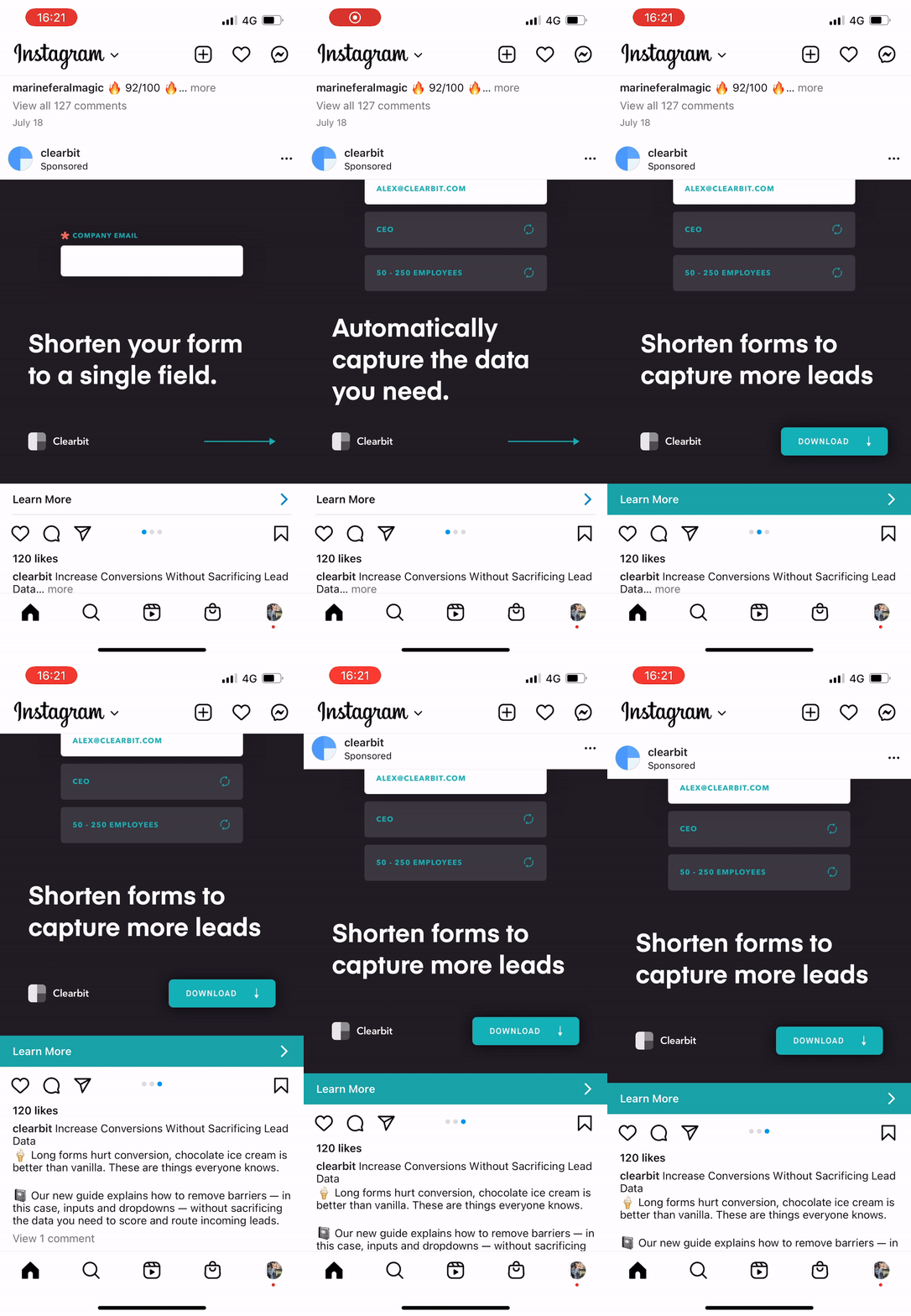
Clearbit’s Instagram ad example is really good because it focuses on specific and tangible advice for their customers to gain value. Not only that but it also gets their ideal target market curious. Why? Because the advice is very specific so there’s not a lot of competition around.
Another interesting aspect is the 3 step Instagram ad format. It’s very unique and very few advertisers use that style. The idea behind a carousel ad on Instagram is that you can share a journey from point A to point B. It’s about showing the steps the user can take from
Finally, Clearbit ends with a strong call to action. The user has seen the value of using Clearbit through the journey they were taken on. It’s simple “want to shorten your lead forms?” then download our ebook. The best ads are very simple but it’s hard to simplify the complex.
18. Retool – Still Graphic
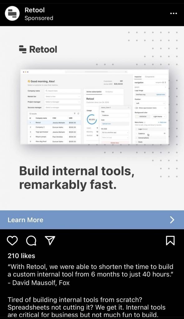
Retool’s Instagram ad example is really interesting for 3 reasons but we first need to understand what Retool does. The company enables developers to create internal tools in an easier way. What they did well is their clear tagline which is also the one on their website. It answers a very simple question: what does Retool do? They help build internal tools, remarkably fast.
The second interesting aspect of this ad is the fact that Retool stands out for something. Notice they didn’t say, we build internal tools in the smoothest way possible. They are actually pushing a strong USP: what they offer is remarkably fast rather than being smooth, easy-to-use or fun.
Last but not least (yes, I use cheesy lines), their ad design is exactly on-brand with their website. It might seem like a lazy move but in reality it’s advertising well-done. When someone clicks, they aren’t surprised to see what’s on the website. In general, the conversion rate from click to lead increases dramatically if the ad matches the website (tagline, design and offer).
19. Motion App – Still Graphic
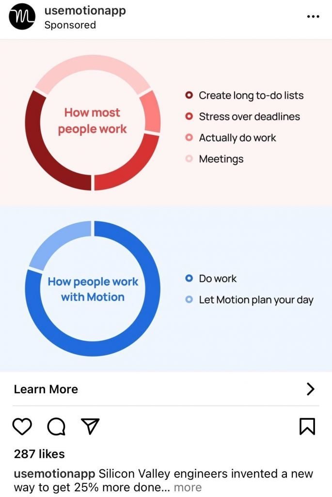
Motion’s Instagram ad example is really powerful. I actually paused on this ad and had to read it because it really sparked my interest. They first tapped into pure human psychology by giving people a way to be different. In reality, your ad should make people feel like they have an edge like they are unique & different by using what you sell.
The format is also very interesting because it allows a comparison which is how most people’s mind works. What is my life with your product and my life without. The comparison works as one of the best tool for educating your customers about your product while making the information relevant to them.
Finally, especially for an app, your goal on an ad is not to sell your product but get people curious enough to try it. This ad keeps it rather vague by saying “let Motion plan your day”. While some people want to manage their day’s, the USP is clear: use AI to plan your day better than you. The concept is powerful because it gets people thinking: let’s see if this AI can plan my day better than me. Obviously, the app has to work but the goal of the advertising is to get people to start.
20. ClickFunnels – Still Image
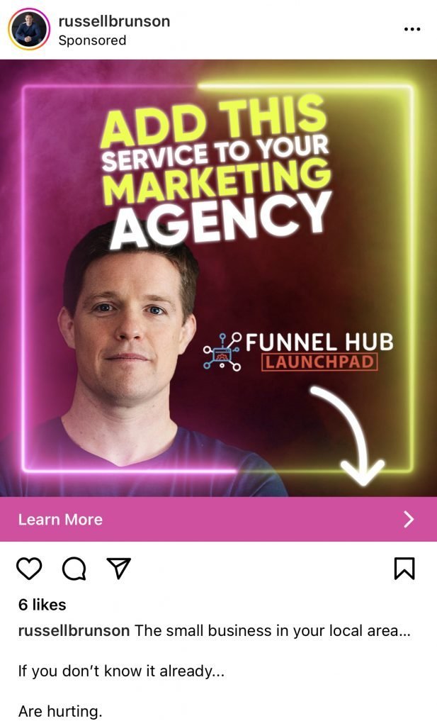
I’ll do something I don’t often do for the ClickFunnels Instagram ad example. I’ll also incorporate things that they didn’t do well in my opinion. If you don’t know, ClickFunnels is a funnel builder which is a fancy way of saying building multi steps landing pages. They are very popular in the get rich quick space.
The first thing that this ad did well was adding colors that stand you. With a bright neon pink & yellow, you are bound to at least stop on this ad to read what it’s about and it’s what I did. In general, I would recommend keeping colours that are on brand and ClickFunnels didn’t use their orange & blue.
The second thing they did well is having a clear tagline on the ad that doesn’t contain more than 7 words. In fact, I would say that 7 words is the maximum amount of words I would add on an ad unless we have a tagline so good that we don’t care about that limit. The reason is we want to be short & punchy and forcing ourselves to reduce the amount of words allows us to do that.
The thing they didn’t do well is creating an ad that provides a more interesting thought than the one we have in mind. In other words, I find the content of the ad boring & not contextual. More and more, agencies are looking to focus & specialize on their core service to attract better clients & get better at what they do.
Furthermore, it’s too much of a “click bait” because they could have mentioned that the additional service was funnel building but then convince people why on the ad. For instance, if we take the Motion Instagram ad before. It’s as if they wrote in the ad “use this to app to improve your life” rather than saying what their app does. Something too generic doesn’t catch the attention.
21. EditorX – GIF

This EditorX Instagram ad example is really good for 3 reasons. The first reason is the concept of sequences in your ad to let users follow a journey. Creating this type of format in your advertising allows the user to easily understand information in easily understandable chunks that lead to clarity.
You can clearly see 3 clear steps:
- How we did this
- Learn 6 strategies & the actual strategies
- Call to action
The other great thing about this Instagram ad is the motion design effect at the beginning. Using colours & moving 2D elements is a great way to grab people’s attention. They are simple, attractive & satisfying to watch. I would even add that only a few advertisers use them which is why they stand out that much.
Finally, the use content elements like sticky note is an awesome way to showcase different points from a list. It would have been easy to make a list from one to six but people wouldn’t have read them. By placing information in animated elements, it makes the eye more curious to finish reading each card of the Instagram ad example.
22. Rothys – GIF
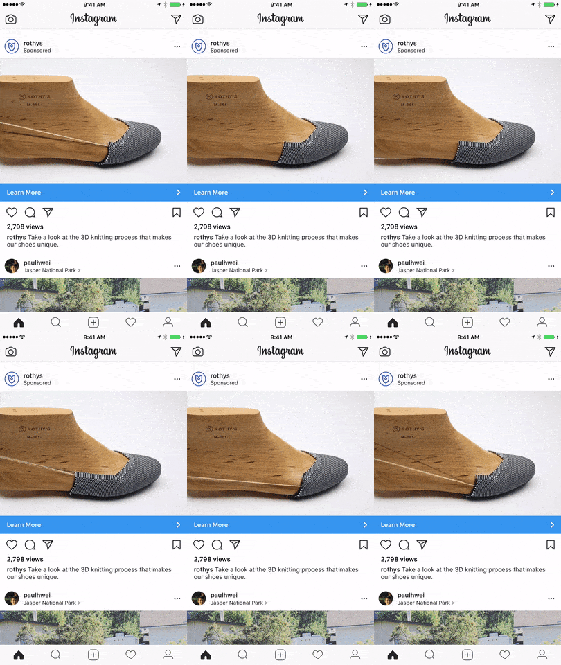
This Rothys Instagram ad example is really good for 2 main reasons. The first aspect is doing something different. Now, this might seem obvious but in general everybody copies each other. By the time you copy someone, 15 other advertisers have created something similar. It’s why creating an ad with a little something different makes a huge difference.
In this case, Rothys has leveraged “how their product is made”, in a somewhat behind the scenes look. Customers love to wear handmade products, showing that is a great marketing strategy when it’s true.
This Instagram ad example is great because the messaging is clear & simple. You are not confused when you read this, you have one goal: look at the 3D knitting process. It gives you just enough to be curious and learn more.
The worst you can do in an ad is bring confusion in the customer’s mind because he will skip your ad altogether.
23. Shaya – Still Graphic

This Instagram ad example from Shaya is a really good example of a good fashion ad. A really good way to make people want to wear your product is to show them on a model & tell them which products that model used. It’s exactly what your fashion customer is looking for in terms of information. Obviously, someone looking at that image will ask themselves if they look like your model so that the product looks good on them too.
The other great aspect of this ad is it’s focus on the product. The amount of fashion Instagram ads I’ve seen over the years with a lot of graphics & text (taking away the focus from the product) is crazy. If you want high quality traffic show your product, it’s what your customers care about. Your role is imply to show your product in its best light.
Now this layout isn’t necessary. In fact, you could add the image on the left side and the products on the right side for instance. Stay creative with your layout but you can’t use bad looking images. While I like the concept, the images from Shaya are a bit blurry which in my opinion devalues the brand.
24. Unluclass – Still Graphic

Did this Instagram ad example stop you right in your tracks? It sure did for me and let me tell you why. First of all, there’s a mention of something a lot of people know about but doesn’t seem as linked which is cup of coffee. There’s a huge power in utilizing elements that a lot of people have in their life as points of comparison. It’s much easier to imagine spending $25 on a book when you compare it to paying $100 on a restaurant.
The other powerful thing is the use of illustrations. More and more brands are leveraging illustrations to explain what their company does and it’s very powerful. Why? You can build anything with illustrations. What the ad is missing is some magic to make the illustration look better than a raw image.
Finally, if you have the name of someone famous that you can use in your ad, please do. Social proof is still one of the best ways of getting people curious. What did you say? Leonardo Di Caprio loves your coffee. I’m getting in the car and picking it up.
25. Pup Socks – Still Graphic
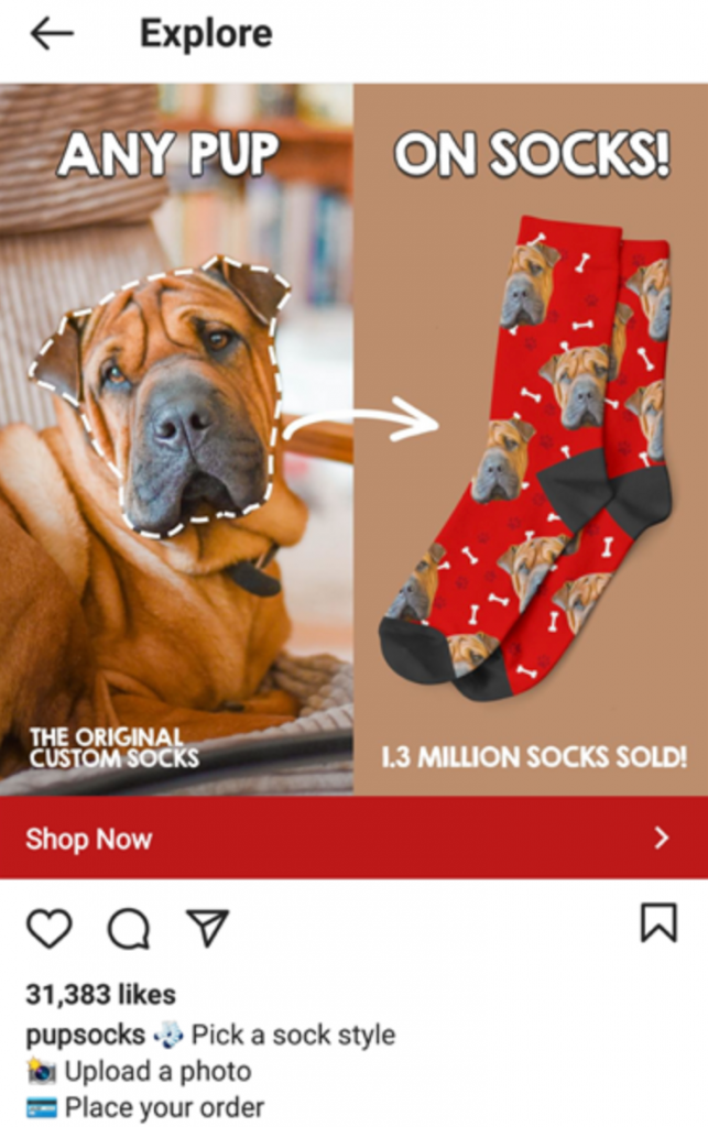
The secret sauce:
- Well explained through graphics
- Social proof & credibility
- Simple design
The Instagram ad example from Pup Socks works really well because the design really explains what the product is about: your pup’s face on a pair of socks. The brand could have chosen to just put their socks as an ad but instead they found a way to incorporate every aspect of the product in a unified way.
You can also tell that the design is oriented towards pup lovers. Creating your ads with your customer avatar in mind makes a huge difference in the response you will get.
Finally, the ad copy on this Instagram ad is a clear step-by-step process. This allows people to know exactly what their next step are.
26. Target – GIF
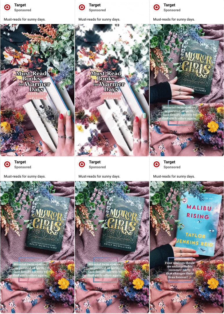
The secret sauce:
- Creating a vibe around your product
- Attracting you rather than forcing
- Very native design
The Instagram ad example from Target is really well-done because it creates a visually appealing environment around their product. It’s nothing new that people take decisions based on their emotions hence why creating a nice decor makes a huge difference in your conversions.
You can also see clearly that this ad provides value, pulling you in. For someone looking for 5 summer book ideas, this ad answers their question and makes them want to read because of the setting.
The best advertising doesn’t look like advertising which bring us to my last point. This ad looks native to the Instagram platform, people are consuming the content without telling themselves “another advertising from Target”.
27. Italic – Still Graphic
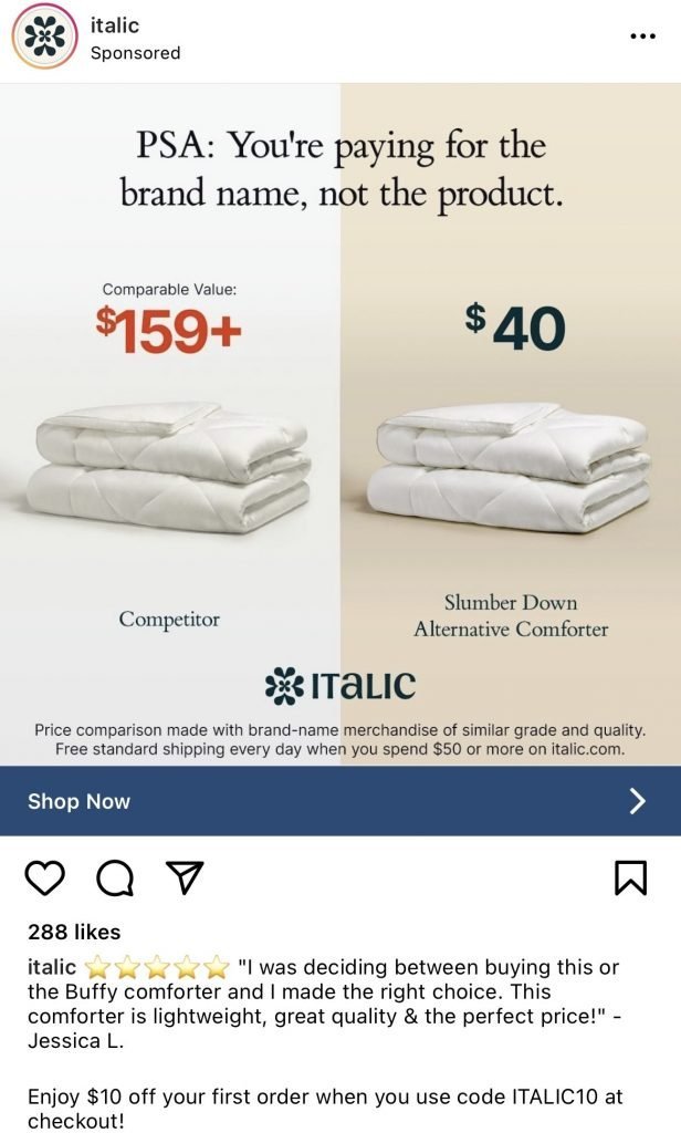
The secret sauce:
- Sharing your competitive advantage
- Using an educational design
- Full transparency
The Instagram ad example from Italic does a really good job at sharing why people should buy from them. In reality, most brands assume customers know their competitive advantage but the truth is different. In this case, if you want to pay for the product and not the brand: Italic is the perfect choice.
It’s also important to find ways to educate your clients in order to draw them in your product rather than force the sale. In this example, you are teaching your clients how to look at the price of a comforter.
I’d also like to add that transparency has been more and more popular in the last few years. When you’re online, being honest goes a long way. By revealing facts, Italic has created trust with its potential client. A very rare currency in today’s world.
28. Fab Fit Fun – Still Image
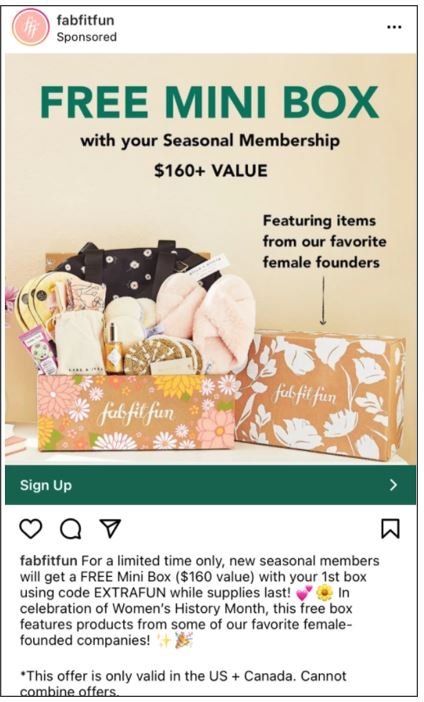
The secret sauce:
- Show the product
- Create an irresistible offer
- Stick to the events
This Instagram ad example from FabFitFun does a lot of things well. The first one is they explain which products customers will get. In fact, I believe there’s no better way to get your customers excited about buying from you than to show them what’s in the box.
FabFitFun offers handpicked fashion & wellness in a box. To me, one of the best way to attract customers is to create an offer for them. You can see in the ad that they will get $160 worth of goods for free. If that isn’t an irresistible offer, I don’t know what is.
Finally, this ad leverages events, more specifically Women’s History Month by supporting women founders. You have to image that whenever there’s an event like this, people see posts about it all over social media. It’s why it ends up being what most people care & think about during that day.
29. Heatherly Design Bed Heads – Still Image
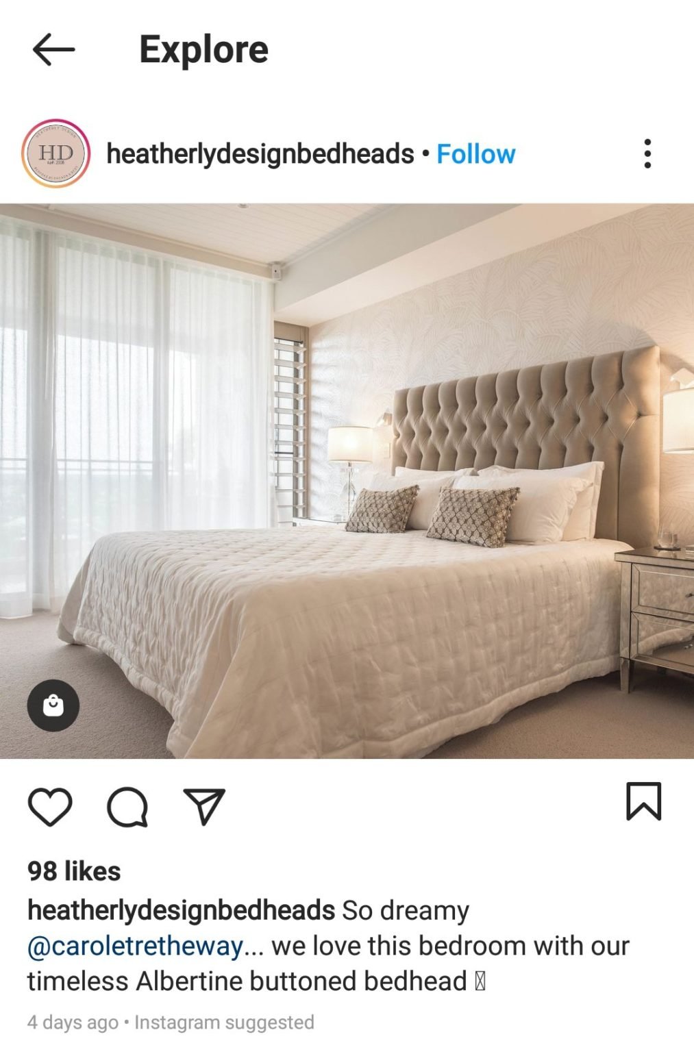
The secret sauce:
- Showcase the product
- Create a nice setting
- Focus on emotions
This Instagram ad example is quite special because it’s inside the discovery page. It’s a great place to create brand awareness but also highlight your product with the highest image quality possible. This ad is really great because it showcases the product in a perfect setting.
In my opinion, any product being sold online should be shown in a beautiful setting when creating an Instagram ad. It does require extra time creating that set up and thinking about what would attract your customers but it’s essential.
The other aspect that this brand does well is to focus on emotions by using the word dreamy. This ad would convey a lot less if the ad copy was talking directly about the product’s feature. Spending a little more time on the copy to make people feel something will go a long way in driving sales.
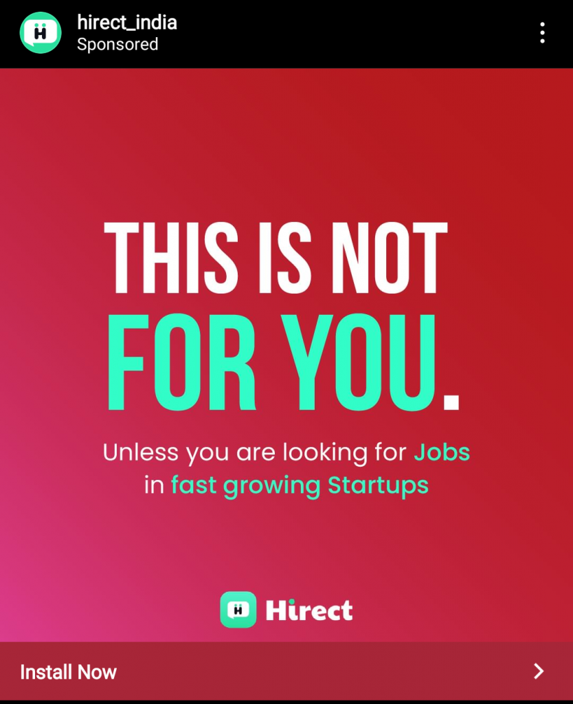
30. Hirect India – Still Image
The secret sauce:
- Eye catching design
- Branded colors & font
- Bold tagline
This Instagram ad example is very simple yet I really like it. First of all, the design is eye catching. It’s not only the choice of colours but also the gradient effect in the background and the variety of colours (white, red, green).
You can also see that those same colours are strongly aligned with the brand’s colours, same for the fonts. I think it’s very important to do such things because it allows for brands to be unique & stand out online.
Finally, the bold tagline really talks to people because you don’t often hear negative ad copy. I strongly believe that the best advertising is unique. Get your computer and make an ad that people have never seen.
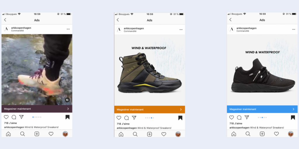
31. Arkk Coppenhagen – Video Carousel
Secret Sauce
- Creative multi images
- Product action-focused
- Creative variety
Although carousel Instagram ads are less popular, they are still very powerful for fashion brands. They allow to show multiple products, in different settings and for different tastes. By seeing more images, you also attract customers who are more likely to purchase. Your cost per click might be higher but since people see more of your brand, they can make a better decision.
We also recommend to show your fashion product in action. Why? It’s much easier to imagine yourself wearing a product if you see someone wearing it rather than a white image. In this example, the video showcases the action while the images show the details.
Stay creative, be different. We rarely see video’s & images combined nowadays because it demands more reflection & thoughts into its creation. This is great news because by creating ads like these, you will stand out & attract more eyeballs.
32. Real Estate – Video
Secret Sauce
- Fast changing scene
- Refined clips
- Matching music
This Instagram ad does a lot of things well but the most important one is that it creates emotions. We keep making tests on the thousands of Facebook ads we make every year and we noticed something. The best ads & ad copy is always centered around emotions rather than features. Every single time!
Let’s get to brass tacks here. If you want your video ad to perform, you must have refined clips, fast changing scenes and the right music. You will notice that the music controls the video: it decides when the frames change, the emotions we feel and the clips that are selected.
You guessed it right, you can often start making a video ad by choosing the music first and then fitting the pieces together. Great music makes a huge difference in how we feel about an ad. Once people are hooked emotionally, they will want to learn about the features but only later.
33. Mountain Equipment Coop – Video
Secret Sauce
- Storyline
- Inspiration focused
- Fast clip movements
This Instagram ad example is definitely not a common ad we see. Most ads are trying to sell you something by showcasing a big discount code. This ad is about inspiration and emotions. While we don’t recommend only using those ads, we believe they are very important to make people connect to your brand. Draw them in, and then sell the merchandise.
This ad also has a powerful message & storyline – the tougher the trail, the better the view. It’s an inspiring message for almost everything in life. People buying products from MEC will have that beautiful feeling inside when using the products.
On the technical side, the clips are changing quickly and isn’t too long. We know how short people’s attention span’s truly are. Make it short and captivating!
34. Mariott Hotel – Video
Secret Sauce
- A little journey
- Revealing shots
- 15-seconds length
This Instagram ad example is very simple but really draws you in because you can picture yourself in this journey. You are traveling somewhere and you have to get to your hotel. The feeling when you arrive and the hotel looks amazing is refreshing. Make your customers go through a journey where they see themselves!
The second great thing about this ad is that the shots taken really do a good job at showcasing the vibe of the hotel – the trees, the staircase and the pool. It’s worth mentioning also that the music is light & amusing. All of these combined make for a very attractive video.
Finally, the length of the video is perfect. You get to experience a whole journey in less than 15 seconds. We usually recommend social media video ads to be under 30 seconds to truly capture people’s short attention span’s. In addition, you could be partnering with travel influencers to make your Instagram ad even more native.
35. Koho – Video
Secret Sauce
- Storyline
- Tutorial focused
- Entertainment first
This Instagram ad example does a few things well. The first aspect that makes this ad special is the strong storyline – you are taken through a journey. The important part here is that the storyline answers the most pressing question – what are the next steps? People want to know what happens after.
This leads me to my second point which is that the ad explains what they customer can expect. While people are curious, they are also short on time. By showing them what to expect, they are better able to make a decision about you.
Lastly, the video is super fun and entertaining. Every single clip in the story line is on-brand, unique & creative. This is very important if you want people to watch your entire Instagram video ad.
36. Hello Tushy – Video
Secret Sauce
- Known situation
- Simple design
- Break belief chains
This Instagram ad example speaks to consumers about situations they know about. The users of Tushy know what they use to clean different things in their house. The powerful thing here is that you will say yes constantly until the final conclusion.
This leads me to my second point about this Instagram ad which is that it breaks a belief chain. People agree to almost everything and then Tushy changes the belief that their visitors need to have to become customers. This belief is what every Tushy customer has: you need to clean your ass in the right way.
Finally, the design is very simple which makes it easy to follow. Company’s often try to have that wow effect but it’s often not efficient to have that on an ad. Your goal is to get your message across and create the right emotions to push people to purchase from you.
37. SEMRush – Video
Secret Sauce
- Strong hook
- FOMO focus
- Solution
This Instagram ad example is a textbook example of direct marketing. You are first hooked with the aspect that fashion & eCommerce is changing. Now, this is what all entrepreneurs know and fear online. The space is changing, we need to change our strategy or we’ll get left behind. It’s very powerful.
You then hear about eCommerce as well, so if you own an eCommerce business, you feel the pain. You feel the pain of missing out on some potential goldmine to scale your business. Finally, you are offered a solution to that pain. You can check out SEMRush’s guide to eCommerce & fashion to stay on top of the trends.
You can create your ads with that format – pain to solution. It doesn’t work for every industry, but it does fit certain ad campaigns. If it doesn’t, focus on the positive. It’s my go-to!
38. Tile – Video
Secret Sauce
- Satisfying
- GIF format
- Product quality
This Instagram ad example does a really great job at captivating the crowd with a simple satisfying GIF. The best eCommerce ads are short, satisfying and show the product under its best light. This is what we’re seeing with this ad where the tiles stack up in a smooth way for you to see the product from the side and the front.
The ad also talks about novelty which is an instant attention grabber – everyone wants to know what’s new and if it can be useful for them. This will attract the early adopters you need to start taking off and expanding your brand. Last but not least, I highly recommend keeping a lot of white space in your ads. It draws people in and makes your design more easy to look at.
39. Clearbit – Carousel 2
Secret Sauce
- Hook on the first
- Process orientation
- Consistent design
We like this Instagram ad example because it has a very simple format everyone can use. You just need to have a strong hook on the first image, ideally resonating with your target market. For advertisers like me, the idea of being able to better retarget on Facebook speaks to me.
The second ingredient is a process to follow:
- A strong hook
- How it works
- Outcome expected
Just ask yourself what is in people’s mind as they see the ad – as if what they want to see next. Finally, make sure your design is consistent with your brand but with your other images. You want people to have a coherent experience throughout the whole time.
40. Top Backpacks – Video
Secret Sauce
- Feature-based
- Product-focused
- Lifestyle testimonial
In simple terms, this Instagram ad example is great because it makes you want to have that backpack. First off, the ad is explaining every amazing feature the backpack has to offer. This allows potential customers to visualize the scenario’s where those features would be most helpful.
You can also that the entire video is about the backpack – it’s pretty much all you see in high quality. This is important – people don’t care about the person, they care about the backpack. You must make your product the center of your ad.
Finally, you get a nice lifestyle shot with nature in the background for the adventure and a great testimonial. Those two combined make a great addition to an already very well-made Instagram ad.
Go Create Your New Instagram Ad!
Now that you’ve seen what makes a great Instagram ad, it’s time to create your own. Take some tips for the ads above and apply them to your next ads. One of the best ways to stay on top of your ads game is to keep a close eye on what makes ads work for other brands.
And remember, we’re always here to help! Get in touch with our team to find out how we can help you reach new heights with your Instagram ads!
