


Hold your phone at arm’s length and open your homepage outdoors at 40% brightness. Read the first paragraph aloud. If you squint, stumble, or reread a line, your visitors do the same — and most of them would quit sooner than you did.
Light gray text on a white background looks refined in a design mockup. Eleven-pixel captions look tidy in a grid. However, both choices cost you readers.
Website readability measures how quickly a person can read and understand text on a screen. Font size, line spacing, contrast, line length, and layout set that speed. Each of them also shapes how a page looks, so you can improve readability and keep the visual style you’ve built.
Here’s how to make text easy to read while the design stays intact, with an example for each adjustment.
Use Descriptive Headings and Scannable Content Sections
Headings tell visitors what a section contains before they read a single sentence. A heading such as “What a Kitchen Remodel Costs by Room” lets a reader decide in a second whether the section answers their question.
- Descriptive subheadings help most on pages with statistics, detailed explanations, or educational content, because readers jump to the part they need.
- Short paragraphs of two to four sentences give each idea its own space.
- Bullet points present lists in a format the eye processes quickly.
Additionally, a logical hierarchy will guide scanning — one H1, H2s for main topics, and H3s for details. Consistent spacing between sections leaves room for large images and custom fonts.
- Start by auditing your site’s longest page.
- Write each H2 as a short answer to a question the reader has, and include the main keyword where it fits naturally.
- Cut any paragraph longer than four sentences into two.
- Convert lists of three or more items into bullets, and keep one idea per bullet.
- Pick one spacing value, such as 32 pixels between sections, and apply it everywhere.
- Check the hierarchy by reading only your headings. If they outline the page, the structure works.
Here’s an example where these practices get to shine:
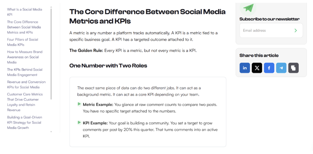
Socialplug is a marketplace where people buy social media engagement, including followers, likes, views, and comments. Their post “Social Media KPIs: A Practical Guide to Picking What Actually Matters” covers a dense topic with many metrics.
The post splits that material into descriptive sections, so readers can jump to the KPI they care about. Paragraphs stay short, and bullet lists appear throughout the post.
That structure makes a technical subject easy to scan, and it’s a pattern you can copy for your guides.
Pair Product Imagery with Clear, Concise Instructions
Shoppers look at images first. Data shows that 56% of users explore the images as their first action on a product page, and many skim or skip the description.
- Short copy placed beside each image reaches readers at the moment they’re looking.
- Captions name what the image shows.
- Brief benefit statements, one line each, tell visitors what a feature does for them.
- Illustrated instructions explain setup or use in a few frames, and they communicate faster than a long paragraph.
On a phone, large type and short lines keep captions readable. There, each frame should show one action so users follow along.
- Inspect your product page by covering the description and checking whether the images alone explain the product.
- Add a caption of ten words or fewer to every image.
- Write each benefit as one line that starts with what the customer gets.
- Turn setup or usage into three to five numbered frames, and put the step text on the image or directly beside it.
- Test the page on your phone and fix any text you can’t read without zooming.
- Lead with your best image.
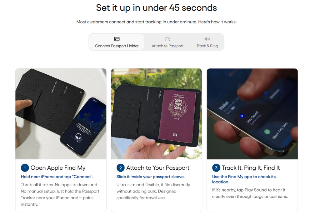
Spotminders makes ultra-slim trackers that keep wallets, bags, and other essentials easy to find. The product page for their trackable passport cover pairs images with short text.
Almost every image on this page carries a description or instruction, either placed on the image or set directly next to it. Benefit statements stay brief, and step-by-step visuals show how to use the product.
This allows shoppers to follow the page by looking at pictures and reading a line or two. That’s a pattern any page can follow.
Improve Text Contrast and Typography for Comfortable Reading
Typography shapes a website’s feel and readability. A legible typeface keeps letterforms distinct on screen. Suitable font sizes and generous line spacing help readers move through paragraphs without losing their place.
Line length matters too. Wide text lines make it harder to track from one line to the next, so narrow columns create excessive breaks.
Color contrast supports every other choice. It can be the difference between keeping visitors and losing them to eye strain. WebAIM’s 2026 review found low-contrast text below WCAG 2 AA thresholds on 83.9% of home pages, up from 79.1% in 2025.
Designers can establish hierarchy through a consistent type system – larger headings, readable body copy, and restrained differences in weight. A considered palette and display face give pages a distinct identity.
- Set body text to at least 16 pixels and line height to 1.5.
- Cap paragraph width near 70 characters.
- Check every text and background pair with a free contrast checker such as WebAIM’s, and you’ll want a ratio of 4.5:1 or higher for body text.
- Choose one heading font and one body font, then build hierarchy with three sizes and two weights.
- Test your brand colors on real backgrounds, including buttons and banners, where light gray text fails most.
- Preview it on mobile.
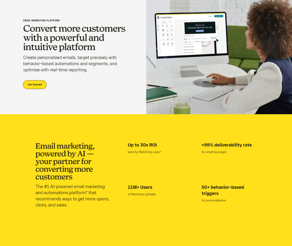
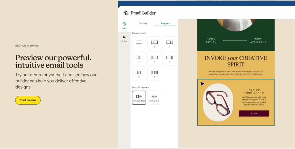
Mailchimp, an email marketing platform, uses a rounded, friendly serif display typeface on its website. Dark charcoal or deep plum text sits on soft yellow, cream, and pastel backgrounds.
These pairings keep contrast high and give pages a warm, approachable mood. Heavy headline weights shift to lighter body weights, which marks the hierarchy at a glance. Playful, creative copy stays easy to scan, and visitors don’t strain to read it.
Also, letterforms and color carry the brand’s personality, so its layouts stay simple.
Organize Technical Information Around User Needs
Technical websites show specifications, compatibility details, and model numbers, and visitors want only the ones that apply to them. Organizing content around what visitors are trying to find solves that:
- Clear category labels name the product group in the words customers already use.
- Compatibility-based navigation sends a visitor with a specific product or device straight to parts that fit it.
- Consistent product naming, with the same order of brand, model, and specification in every title, lets people compare items quickly.
Structured categories make a complex catalog feel orderly, and product photos and brand styling can stay exactly as they are. This allows visitors to reach the specification they’re after without reading unrelated information.
- List the questions your visitors ask most, and turn each answer into a category label.
- Write labels in customer vocabulary.
- Group navigation by one primary logic (for example: use, brand, or performance) and keep that order on every page.
- Set a naming template for every product title and apply it across the catalog.
- Keep specifications under their category.
- Run a test where five people find one specific product, and rename any label that’s slowing them down.
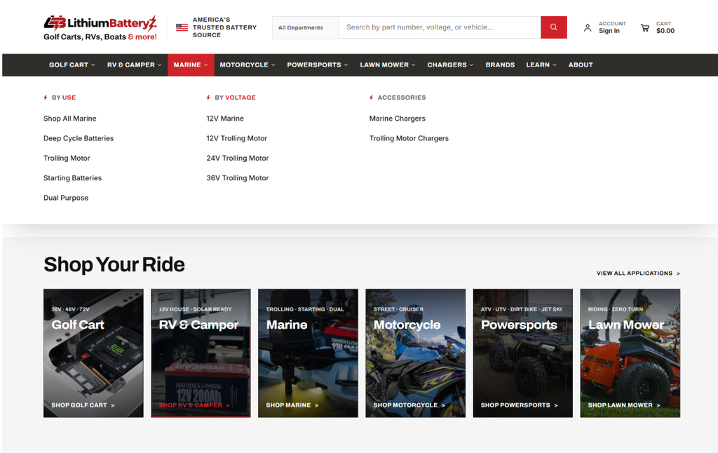
LithiumBatteryZ sells lithium batteries and conversion kits, and its website arranges the technical details into vehicle-specific categories.
The main navigation splits products by use, brand, and voltage. The homepage follows the same method, with category labels as its main focus.
A visitor who knows their vehicle or voltage can pick the matching category and see relevant products. Labels stay clear and consistent from the menu to the homepage, so the catalog feels organized.
Use White Space and Consistent Layouts to Reduce Visual Clutter
White space separates information into groups the eye recognizes at once:
- Alignment places related items on shared edges, and consistent layouts repeat the same arrangement from page to page.
- Spacing between headings, paragraphs, images, and other elements shows visitors where one idea ends and the next begins, so borders and decorative graphics become optional.
- Consistent margins and content widths give every page the same proportions.
- A grid layout, with columns and rows used the same way throughout, keeps pages polished and prevents crowding.
This way, visitors learn the arrangement once and find content faster on each later page.
- Pick one spacing scale, such as multiples of 8 pixels, and use only those values for margins and padding.
- Add more space above each heading than below it.
- Set one maximum content width and apply it to every page template.
- Align text, images, and buttons to the same column edges.
- Remove borders and background boxes you don’t need, and let space do the grouping.
- Review each page by squinting at it. If you still see three or four distinct groups, the layout works.
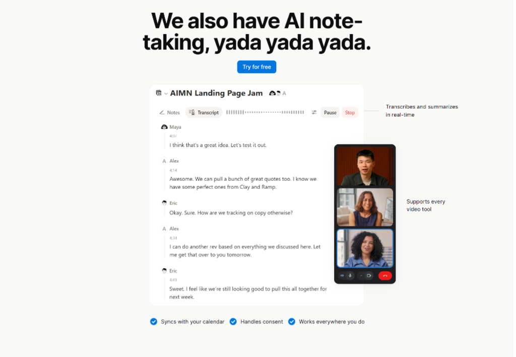
Notion offers productivity, AI note-taking, and workspace software, and its website uses white space throughout.
Text blocks sit inside generous margins and padding, with open background areas around them, so visitors scan text and feature lists comfortably. Content blocks stay clearly separated. Simple monochrome illustrations use consistent stroke weights and plenty of internal white space, and they support the copy.
Every section repeats these patterns, so the layout looks consistent as visitors scroll. It’s an approach any brand with dense content can adopt.
Simplify Product Browsing with Goal-Based Filters
Product-heavy websites can show a long list of items and specifications, and visitors rarely need all of them. Filters let visitors control what they see.
Goal-based filters, such as muscle recovery or better sleep, match how people think about a purchase. Attribute and preference filters, such as size, material, or dietary needs, narrow the list further.
Each filter option needs a plain label that names exactly what it does. Familiar controls work best – checkboxes for multiple choices, one clear reset option, and a visible count of results.
The product grid should keep the same card size, image ratio, and spacing as results change, so the whole page stays visually orderly.
- Start with the three or four reasons customers buy from you, and make each reason a filter.
- Label filters in the customer’s words.
- Add attribute filters for the details shoppers compare most, like price, size, or ingredients.
- Keep the filter list short and group related options.
- Update results immediately after each selection and show the number of matching products.
- Keep every product card the same size, and add a reset button customers can’t miss.
- Use search data to learn which filters customers want.
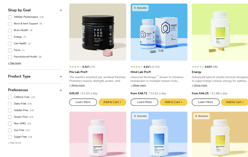
Performance Lab sells nutritional supplements, and its fitness supplements category page simplifies browsing with goal-based and dietary-preference filters.
A left sidebar lets customers filter by goal, product type, and dietary preferences. The product showcase updates immediately when a customer selects a filter, so the results match the choices. This allows customers to see the products that fit their goal and diet, and the whole page stays easy to read.
This approach guides shoppers from a broad collection to relevant products. Visitors don’t need to open every product page to get that experience.
Final Thoughts
Open your highest-traffic page and change one thing today. Shorten a long paragraph, raise a contrast ratio to 4.5:1, or add a caption to your main product image.
Then, track how long visitors stay and how far they scroll for two weeks. The results will show which of these six tactics your audience responds to most.
Screens, browsers, and reading habits keep changing, so schedule a readability review every quarter. Each review checks that the style choices you’ve made still support easy reading.