


The effectiveness of your homepage in attracting prospects into your sales funnel is highly dependent on messaging. Yes, the majority of impressions that first-time web visitors form about a brand are based on design. Nevertheless, it’s your copy and value propositions that will, ultimately, determine your target audience’s purchase intent.
Not convinced? Just consider that most consumers ignore marketing messages that aren’t relevant to their experience (while personalization makes them more likely to convert). Moreover, research suggests that specific message types directly elevate consumers’ buying behavior. Sales alerts boost purchase intent for85% of shoppers, back-in-stock notifications for 81%, and loyalty point reminders for 77%.
So, if you’re looking for tactics to engage, nurture, and convert visitors, optimizing your ecommerce homepage messaging might just be what you need to do.
This article provides an overview of the best six strategies for accomplishing this goal, along with real-life examples you can draw inspiration from. Let’s get into it.
Lead with a Clear Value Proposition That Informs Instantly
One of the most essential things to comprehend about the typical buyer’s journey is that product understanding and knowledge directly drive movement through the sales funnel.
If you look at scientific research, you’ll discover that both product knowledge and brand awareness have a positive impact on purchase intention. And if you examine consumer segments who add an item to their carts but abandon their purchase afterward, you’ll find that 85% of them do so due to frustration or indecision.
In other words, the best way to engage, nurture, and convert customers isn’t just to impress them with marketing messages that grab their attention and tickle their imagination. Ensuring they stick around and enter your sales funnel requires you to present them with exceptionally clear value.
With this in mind, one of the best strategies for optimizing your homepage messaging is to lead with a clear value proposition that instantly informs your ideal customers of the benefits they can unlock by converting.
For example, take a look at how Performance Lab achieves this in the hero section of its homepage. Here, the business strongly emphasizes that its products are all clean, premium-grade, science-based supplements that work. This approach works for two reasons.
On the one hand, Performance Lab understands that reliability and ingredient quality are two of its core differentiating characteristics in an otherwise low-trust industry. On the other hand, the brand also understands that mentioning just a few core product characteristics (related to quality and safety) creates sufficient clarity and communicates exceptional value, automatically drawing web visitors into the sales cycle and gently nudging them toward a positive purchase decision.
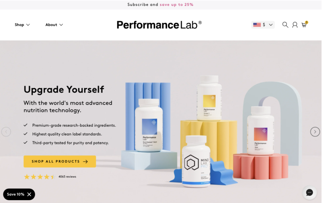
Source: performancelab.com
Use Visuals and Supporting Copy to Strengthen Product Messaging
Text can be exceptionally powerful at engaging web visitors and inspiring them to convert. However, the simple fact of human psychology is that people naturally react more strongly to visuals.
In fact, if you look at the scientific research from MIT, you’ll discover that half of the human brain is directly or indirectly devoted to processing visual information. Furthermore, people comprehend this type of info in exceptionally short time spans — sometimes as little as 13 milliseconds.
Of course, it’s also worth noting that visuals and multimedia align with how consumers prefer to learn about products. Survey data suggests that 63% of people prefer to collect product information by watching a video (compared to just 12% who enjoy text-based articles).
Therefore, if you wish to optimize your ecommerce homepage, it’s a great idea to use visuals and minimal supporting copy to strengthen your product messaging.
For example, check out how Ice Cartel implements this product messaging strategy. This brand’s primary aim is to position its products as high-quality, luxurious, and a secret ingredient to a desirable lifestyle. So, instead of using words to convey these qualities, Ice Cartel lets its product imagery do the talking. At first glance, this simply creates an appealing visual effect that drives consumer interest. But a closer look reveals that this tactic (especially because it’s backed by social proof) creates a whole microcosm of aspirational lifestyles, making Ice Cartel’s products practically irresistible to shoppers whose tastes align with the way of living the brand represents.
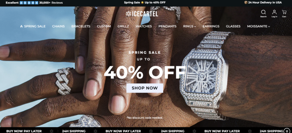
Source: icecartel.com
Address Common Buyer Questions Directly on the Homepage
Trust and credibility are crucial factors in today’s typical buyer’s journey. In fact, research demonstrates that reliability and brand competence are just as powerful purchase factors as product pricing and quality. Furthermore, survey data suggests that consumers won’t even consider buying from businesses unless those brands have sufficient real customer feedback to support their ability to resolve customer pain points.
Naturally, showcasing social proof and trust signals throughout your entire online presence (yes, on your homepage too) can be a great method to engage web visitors and inspire them to convert. Nevertheless, it’s just as important to invest in content that addresses and answers their questions (and hopefully removes their conversion obstacles).
The reason for this is simple. Consumers who feel that making a particular purchase decision is low-risk are far more likely to convert than those who don’t.
Various formats can help you accomplish this goal. UI elements such as banners, pop-ups, and microcopy can all help address common consumer concerns. However, if you operate in complex niches or sell innovative products, your target audience is likely to need more in-depth answers to be convinced that your solution can remove their pain points.
With this in mind, don’t hesitate to dedicate sufficient attention to your ideal customers’ questions — right there on your homepage.
For example, Oura does it by dedicating a significant portion of its digital presence to explaining how its smart ring works. On the one hand, the brand utilizes homepage messaging to provide visitors with brief explanations of what the wearable device does and how it benefits customers. On the other hand, it also invites prospects to take a deeper dive into a dedicated How It Works section, where Oura guides prospects through every single scenario in which its solution can provide customers with feedback, data, or guidance.
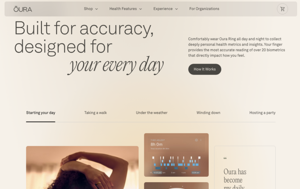
Source: ouraring.com
Use Navigation Categories to Support Product Discovery
One of the most prominent consumer behavior trends for 2026 and beyond is that shoppers are demanding more convenience, both online and offline. And while, in most cases, this convenience is measured in speed, accessibility, and availability, it’s worth noting that shoppers also want streamlined buying experiences.
With this in mind, one of the best strategies to optimize your homepage messaging is to do so in a way that allows your target audience to move from awareness to purchase as quickly as possible.
In addition to designing intuitive navigation menus and mechanisms, pay equal attention to what you name product categories and how you invite your audience to approach product discovery.
Simplicity is always an excellent approach. Nevertheless, if you have a large inventory, you might need to combine your copywriting skills with UX design to ensure a streamlined shopping experience for your prospects.
For example, check out how Sewing Parts Online implements this tactic on its homepage. Given that it sells several tens of thousands of products, this business designed a user-friendly process to help prospects find the spare parts they need. First of all, Sewing Parts Online invites web visitors to “shop [their] machine,” then it instructs them to select their preferred brand, model, and part type. This process might be slightly more complex than the typical navigation menu. Nevertheless, it ensures that potential customers receive relevant product suggestions for their needs, thereby improving their customer experience and increasing their likelihood of finding what they need to resolve their pain points.
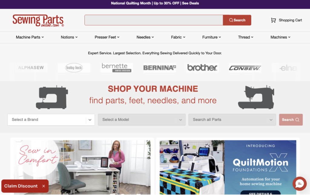
Source: sewingpartsonline.com
Showcase Use Cases That Help Shoppers Visualize the Product
In some cases, the most effective method to engage web visitors with your homepage messaging isn’t to make impressive promises about what they could do if they convert into customers. Instead, all you need to do is encourage your audience to imagine themselves in (relevant) scenarios utilizing your solutions.
The best way to accomplish this goal is to showcase use cases that help shoppers visualize your products in use.
An approach like this obviously boosts clarity when communicating product value. It can also be exceptionally powerful at boosting purchase intent — even when your prospects’ motivation to buy was low to begin with.
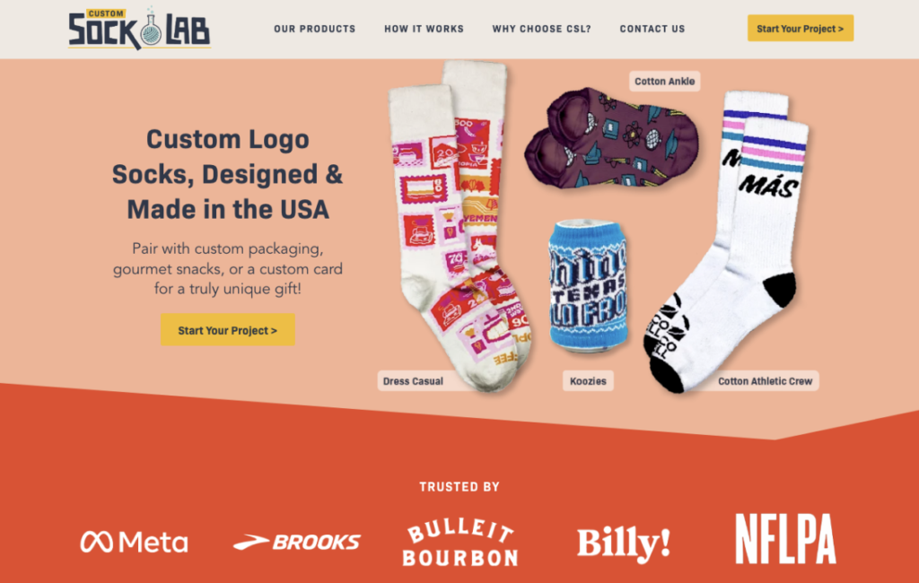
For example, if you take a look at the Custom Sock Lab homepage, you’ll notice that this business frames its niche product (socks) through various real-world applications. By showing how businesses can use these products for team-building, relationship-building with potential clients at events, or even delighting existing customers and inspiring loyalty, Custom Sock Lab introduces valuable use cases for its audience, encouraging them to visualize the outcomes they could achieve by investing in this type of branded merch.
Reinforce Brand Personality Through Consistent Messaging
Last but not least, when aiming to perfect your ecommerce homepage messaging, it’s worth noting that inspiring consumers to click “Buy” doesn’t simply boil down to telling (and showing) them that you offer effective solutions to their pain points.
Instead, it’s equally important to remember that emotions,brand relationships, and even mere exposure (that is, familiarity) influence buyers’ behavior.
Furthermore, it’s crucial to remember that the typical sales cycle isn’t exactly short. Most shoppers require several brand touches before even considering making a purchase.
Therefore, if you consider the fact that brand discovery often takes place on social media, it’s essential that, upon landing on your website, your target audience encounters something that aligns with their expectations.
The best way to ensure this is to reinforce your brand’s personality and identity through consistent messaging across all distribution channels.
By staying true to your brand’s visual identity, voice, and tone, as well as repeating core messages throughout your online profiles, you can guarantee that your prospects will find what they expect (and perhaps even like about your business) on your homepage, making them far more likely to consider a purchase.
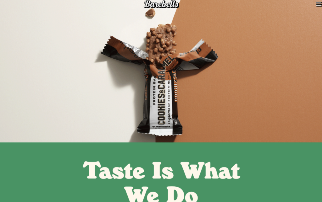
For inspiration on what this can look like in real life, check out Barebells. The brand maintains a highly recognizable visual identity across all its channels, plus it uses highly consistent messaging with a slightly playful tone. Furthermore, the product characteristics it emphasizes are consistent throughout its online presence, where Barebells places a strong focus on the high protein and low sugar content of its snacks.
Source: barebells.com
Final Thoughts
Great homepage messaging can be exceptionally powerful — no matter the size of your business. Nail it, and you’re bound to engage your ideal customers and draw them into your sales funnel. However, if you miss the mark, you don’t just risk the possibility of alienating your target audience. That kind of mishap may even cause potential customers to form a negative first impression of your brand, significantly diminishing their chances of converting down the line.
With this in mind, always keep a close eye on your homepage copy. Be completely user-centric when describing the value of your offer, utilize comprehension-boosting formats to enhance product understanding, address your prospects’ main conversion obstacles, and make it easy for potential customers to find what they need or identify relevant use cases for your products.
Do all of these things, and you’re bound to see positive outcomes. If you feel like your homepage copy still isn’t what it could be, make incremental changes and see how they affect engagement rates. Then keep what’s working and continue changing whatever isn’t. At some point, you’ll land on an approach that meets your brand’s unique needs, empowering you to scale your efforts and broaden your reach.