
People rarely arrive on a website ready to study it. They scan, judge, scroll, hesitate, and decide whether anything feels worth their time.
Good design accounts for that behavior. It removes friction, answers questions early, and gives visitors a clear next step before attention fades.
The way you arrange elements on a page, the colors you use, where you put your buttons, how much breathing room you give your content – all of it either guides people toward action or quietly works against you.
We’ve tested this stuff obsessively. What follows are the design elements that actually earn clicks, signups, and sales.

Above-the-Fold Design That Drives Immediate Action
Visitors decide whether to stay or leave within seconds of landing on your page. Everything they see before scrolling (your headline, your CTA, your imagery, etc.) has to do enough work to make staying feel worthwhile.
If it doesn’t, no amount of great content below the fold will save you.
Here’s how to get this right:
- Lead with a specific, useful headline. Skip the vague mission statements. Tell visitors exactly what you do and why it matters to them. The more concrete, the better.
- Put your primary CTA where eyes naturally land. That’s usually center-screen or just below your headline. Don’t make visitors hunt for it.
- Cut everything that doesn’t earn its place, such as navigation links, social icons, or secondary offers. If it’s not helping a first-time visitor understand what to do next, it’s competing with your CTA.
- Use visual hierarchy deliberately. Size, contrast, and spacing should draw attention in a specific order: headline first, supporting detail second, action third.
- Keep your imagery purposeful. Hero images and videos should reinforce your message, not just fill space. If it doesn’t add context, it’s noise.
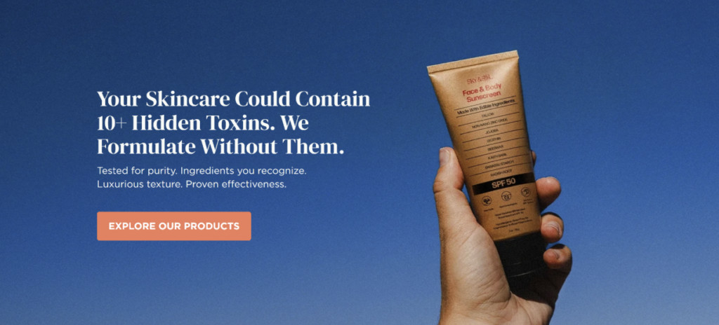
Sky and Sol is an example of a brand that does this exceptionally well. This is a natural skincare brand focused on toxin-free formulations, and they’ve nailed their above-the-fold section.
Right in the header, they address a real concern their audience has (the presence of harmful ingredients in conventional skincare products) and pair it with a clear, low-pressure prompt to explore their range. There’s no clutter and competing messages. Visitors immediately understand what the brand stands for and exactly where to go next.
That’s a lot of conversion work happening in a very small amount of space.
CTA Designs That Increase Clicks and Conversions
Your call-to-action button is the moment everything either comes together or falls apart. You can earn your visitor’s attention and interest, but if you hit them with a button that says “Submit”, you’ll immediately kill the momentum.
CTA design goes deeper than color and size. The language, placement, and repetition all play a role in whether someone clicks or doesn’t.
Here’s how to get this right:
- Write CTAs in the first person. Changing “Start your trial” to “Start my trial” sounds like a small tweak, but studies show first-person framing consistently outperforms second-person by anywhere from 10% to 90%. It shifts the button from an instruction to a decision the visitor is making for themselves.
- Make buttons visually impossible to miss. Use your accent color, ensure strong contrast with the background, and give buttons enough padding that they don’t look cramped.
- Lead with the benefit, not the action. “Get my free report” works harder than “Download now” because it tells visitors what they’re actually getting.
- Repeat your CTA at logical intervals. Don’t rely on a single button at the top. Place CTAs where visitors naturally pause, such as after key information, at the end of sections, and before the footer.
- Avoid vague language. Words like “Click here” or “Learn more” don’t tell visitors what happens next. Be specific.
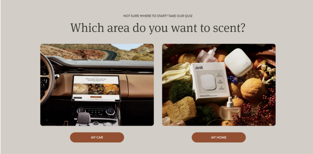
Drift, a brand selling car and home fragrance products, handles CTAs with real consistency.
Their buttons stay in a distinct accent color throughout the site, contrasting cleanly against each background. They’re benefit-driven, visually prominent, and appear at natural decision points, nudging visitors toward engagement repeatedly without ever feeling aggressive or repetitive.
This approach keeps engagement high without making the site feel pushy.
Trust Signals That Reduce Hesitation and Boost Conversions
People don’t hand over their email, money, or personal details to websites they don’t trust. And trust isn’t something visitors extend automatically. Your design has to earn it, fast.
The good news is that a handful of well-placed trust signals can do most of that work before a visitor even reads your copy.
Here’s how to get this right:
- Show social proof near your CTAs. Reviews, ratings, and testimonials placed close to action points directly reduce the hesitation that stops people from clicking. Proximity matters here.
- Display credentials and certifications visibly. If you’ve got industry recognition, press mentions, or professional affiliations, put them somewhere prominent, not buried in a footer.
- Use real photography where possible. Stock images read as generic. Real photos of your team, workspace, or customers signal authenticity in a way that polished stock imagery simply doesn’t.
- Be transparent about processes and policies. Clear return policies, privacy statements, and contact information tell visitors there’s a real, accountable business behind the site.
- Let the design itself signal quality. Inconsistent fonts, broken layouts, and slow load times undermine trust before a visitor reads a single word. Clean, professional design carries its own credibility.
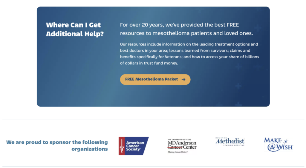
Mesothelioma.net, a site providing free information and guidance for people diagnosed with mesothelioma, operates in one of the highest-stakes niches imaginable. Their design reflects that responsibility.
Expert-backed content, clearly displayed credentials, and reassuring visual choices work together to signal authority and care from the first page load.
Visitors facing difficult, life-altering decisions need confidence before they’ll engage. The site’s trust-centered design delivers exactly that without feeling clinical or cold.
Product and Service Pages Built for Action
Most product and service pages fail at the same thing. They describe rather than persuade. They list features, show a photo or two, and leave visitors to connect the dots themselves.
The pages that actually convert do something different. They guide visitors through a logical sequence that builds understanding, addresses doubt, and makes taking action feel like the obvious next step.
Here’s how to get this right:
- Lead with outcomes, not specifications. Visitors want to know what changes for them after they buy or sign up. Start there, then back it up with the details.
- Structure the page to mirror the buying thought process. Interest comes first, then evaluation, then hesitation, then decision. Your page layout should follow that same order.
- Use visuals that demonstrate, not just decorate. Product photography, explainer graphics, and before-and-after comparisons all help visitors understand what they’re getting better than descriptive copy alone.
- Address objections directly in the page copy. If price, safety, or effectiveness are common concerns, tackle them head-on rather than hoping visitors won’t think about them.
- Make the purchase or inquiry step frictionless. Complicated forms, unclear pricing, and too many steps between interest and action all bleed conversions.
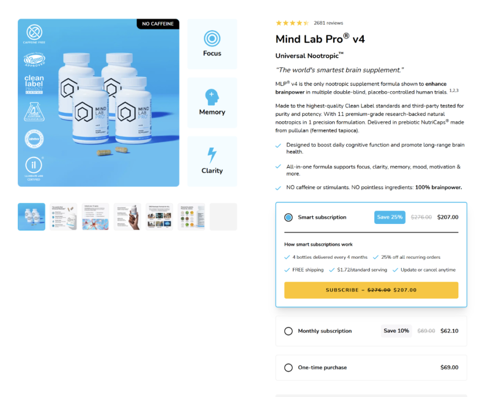
Mind Lab Pro, a cognitive performance supplement brand, builds product pages that move visitors through a clear, structured journey.
They open with benefit-driven messaging, layer in scientific backing and ingredient transparency, and weave purchasing prompts throughout. That way, visitors never have to scroll back up to act.
The balance between education and persuasion keeps the page feeling informative rather than salesy, while consistently nudging visitors toward a confident purchase decision.
Interactive Design Features That Increase Engagement
Static pages ask visitors to read and decide. Interactive ones ask them to participate. That difference changes everything.
When visitors click, answer, explore, or configure something on your site, they’re invested in the outcome. That investment keeps them on the page longer and moves them closer to conversion.
Research backs this up. Interactive experiences generate 52.6% higher engagement rates than static content, showing how movement and input change attention and retention patterns across digital journeys.
Here’s how to get this right:
- Add a quiz or assessment where it makes sense. If your product or service requires some degree of personalization, a short quiz can replace a cluttered catalog and deliver a more relevant result for each visitor.
- Use interactive pricing or product configurators. Letting visitors build their own package or see costs adjust in real time reduces uncertainty and keeps them engaged with specifics rather than generalities.
- Include hover states and micro-animations. Small visual responses to user actions make a site feel alive and intuitive. They also subtly guide visitors toward clickable elements.
- Let users filter and explore on their terms. Giving visitors control over how they browse (by category, use case, or preference) makes the experience feel tailored without requiring a full quiz build.
- Test interactive CTAs. Buttons that respond visually when hovered or clicked perform better than flat, static ones. Small details signal a polished, responsive experience.
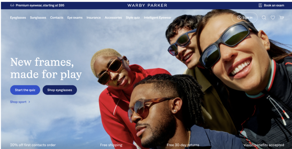
Warby Parker, known for their accessible everyday eyewear and frames, greets visitors with a quiz rather than an overwhelming product catalog.
Visitors answer a few questions about their style preferences and face shape, and the site returns a curated frame selection matched to their answers.
This turns browsing into a guided experience and makes the path to purchase considerably shorter.
Mobile UX Choices That Improve Conversion Rates
Over half of all web traffic comes from mobile devices, yet plenty of websites still treat mobile as an insignificant enhancement.
Visitors on mobile are just as ready to convert as desktop users, but they’re less patient. Slow load times, tiny tap targets, and layouts that require horizontal scrolling will lose them in seconds.
Designers who refine mobile UX often see higher completion rates across forms, purchases, and inquiries because the path feels direct and stable.
Here’s how to get this right:
- Design for thumbs, not cursors. Buttons and interactive elements need to be large enough to tap comfortably without zooming in. The bottom half of the screen is the easiest reach zone. Put your primary CTA there.
- Simplify your navigation. Mobile menus should be clean and shallow. If visitors need three taps to find what they’re looking for, you’ve already lost some of them.
- Prioritize page speed aggressively. Compress images, minimize render-blocking scripts, and test your load times regularly. Every additional second of load time reduces conversions meaningfully.
- Stack content vertically with intention. The reading and scrolling pattern on mobile is linear. Structure your content so the most important information appears first and the CTA follows naturally.
- Test on real devices, not just browser simulators. Emulators miss things. Actual device testing reveals spacing issues, font rendering problems, and interaction quirks that simulators don’t catch.
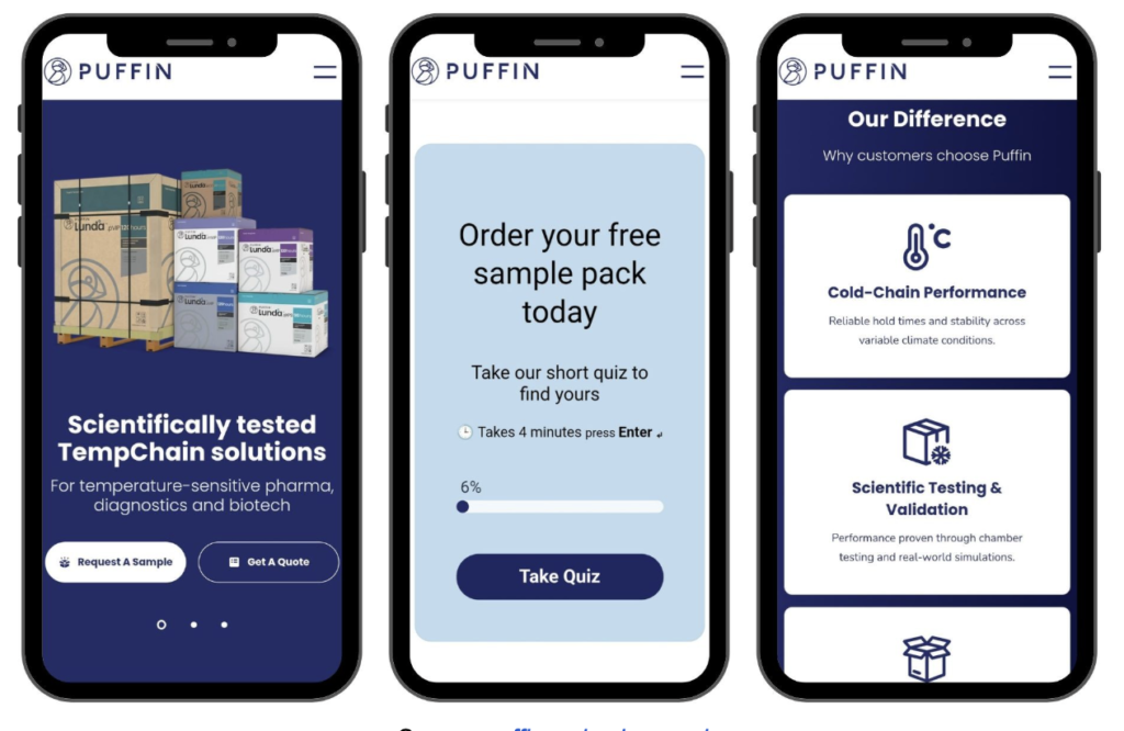
Puffin Packaging, a company offering eco-conscious, temperature-controlled packaging solutions, delivers a mobile experience that feels deliberately built rather than retrofitted.
The layout renders cleanly across screen sizes, loads quickly, and keeps navigation straightforward. Nothing fights for attention, and nothing feels out of place.
That’s exactly what a well-executed responsive design should feel like.
Final Thoughts
Most of the visitors who left your site without converting weren’t uninterested. They were just never given a clear enough reason to stay.
That’s not a traffic problem or a pricing problem. It’s a design problem, and design problems are solvable.
Every section in this article points to the same underlying principle: visitors follow paths, not pages. When your design lays out a clear path, they walk it. When it doesn’t, they leave and look for one somewhere else.
Your competitors are probably still guessing at this. That’s your opening.