


I spent twenty minutes on a software company’s website last week and still couldn’t tell you what they actually sell. Their homepage used words like “empower,” “streamline,” and “personalize at scale.” It talked about “ecosystems” and “consolidation capabilities”.
I ended up leaving frustrated and bought from a different company that just told me what their product does.
This happens constantly. B2B websites bury their value under layers of safe, meaningless language. Meanwhile, the people visiting those sites are actual humans with actual problems, actively looking for a solution. When they land on your site and can’t quickly understand how you help, they don’t give you the benefit of the doubt. They leave.
Recent research backs this up: 81% of consumers ignore irrelevant marketing messages.
Let’s talk about how to stop that from happening.

Lead with a Clear Value Proposition Above the Fold
Your homepage’s above-the-fold area is the first thing visitors see before they scroll. If it doesn’t immediately tell them what you do and why it matters, most won’t bother finding out.
A strong value proposition answers three questions fast:
- What do you do?
- Who do you do it for?
- What’s the result?
When visitors get those answers within seconds, they’re far more likely to stay and explore. When they don’t, they’re gone.
Here’s how you can do this on your website:
- Write your headline around the outcome you deliver, not the process behind it. “Lower your tax bill” beats “Comprehensive tax optimization solutions” every time.
- Avoid jargon. If your grandmother and your best client can’t both understand your headline, rewrite it.
- Keep it specific to your audience. “We help companies create professional invoices in minutes” lands harder than “We provide innovative accounting tools.”
- Pair your headline with a short supporting line that adds context. Use just one sentence, no more.
- Test it. Run A/B tests on headline variations and let the data tell you what’s actually resonating.
To see how successful companies actually do this, let’s take a look at the following example:
R.E. Cost Seg, a company that helps real estate owners reduce their tax burden through cost segregation studies, nails this on their homepage. Their value proposition, “Lower Your Taxes and Increase Cash Flow,” is direct, outcome-focused, and immediately relevant to anyone in their target audience. You won’t encounter any industry jargon or vague promises.
This way of communicating allows visitors landing on that page to understand within seconds whether this service is for them. That’s exactly how it should work.

Use Social Proof to Reinforce Your Core Product Message
People trust other people more than they trust brands. 72% of consumers won’t take action until they’ve read reviews or testimonials first. B2B buyers, who typically have more at stake in their purchasing decisions, are no different.
Social proof doesn’t just build trust. It also reinforces what your messaging is already saying, making your value proposition feel earned rather than claimed.
The key word here is “reinforce.” Social proof works best when it connects directly to your core message, not when it sits on the page as a generic collection of five-star ratings.
Here’s how you can do this on your website:
- Pull quotes that speak to specific outcomes, not general satisfaction. “We saved 40 hours a month” beats “Great product, highly recommend.”
- Place testimonials near the claims they support. If your headline promises faster results, the testimonial below it should confirm faster results.
- Include recognizable details, such as company names, job titles, and industries. This helps visitors see themselves in the review.
- Use metrics where you can. Numbers are specific, and specific is credible.
- Don’t hide social proof at the bottom of the page. Weave it throughout.
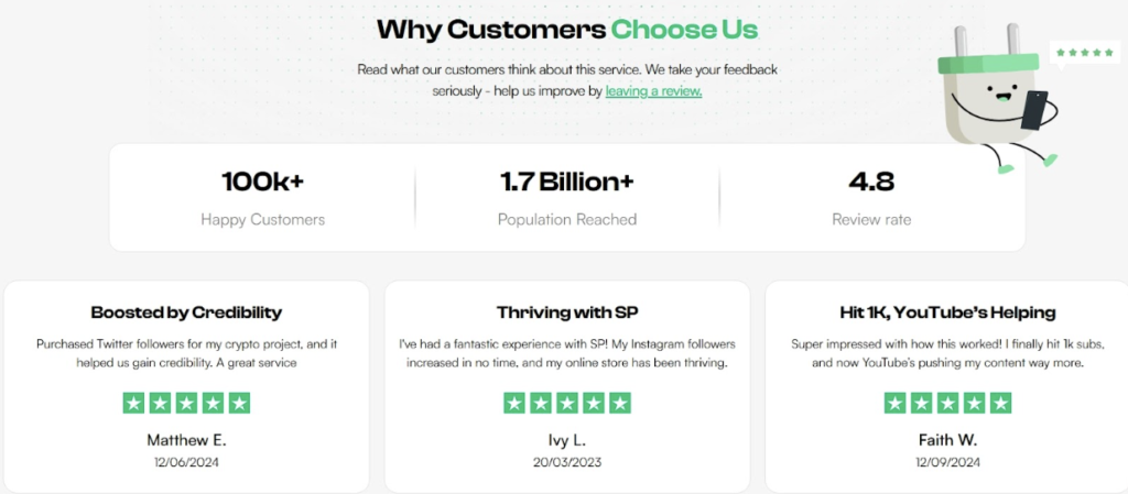
Socialplug, a marketplace where creators and brands can grow their social media presence with engagement, does this well.
Their homepage combines customer reviews, concrete metrics, and testimonials in a way that directly supports their value proposition. Visitors can see claims about what the platform delivers and observe actual evidence from real users.
This combination of messaging and proof gives potential customers a reason to trust what they’re reading.
Address Buyer Hesitations Before They Become Objections
Every visitor arriving on your B2B website carries silent doubts. Is this legitimate? What if it doesn’t work? Can I trust these people with my money?
If your messaging doesn’t address those doubts proactively, they quietly pile up until the visitor talks themselves out of converting.
The mistake most B2B websites make is waiting for prospects to raise objections through a sales call, a contact form, or a follow-up email. By then, many have already left. Addressing hesitations directly on the page keeps doubt from becoming a reason to disengage.
Here’s how you can do this on your website:
- List the most common questions your sales team receives and answer them on the page. Don’t put them in an FAQ buried in the footer.
- Be specific about guarantees. “Satisfaction guaranteed” means nothing. “Full refund within 30 days, no questions asked” means a lot.
- Acknowledge risk openly. Visitors respect honesty, and naming the concern before they do builds credibility.
- Use trust signals near your CTA. Guarantees, certifications, or return policies work hardest when they’re placed where the decision happens.
- Talk to your customer support team. They know exactly what’s making people hesitate.
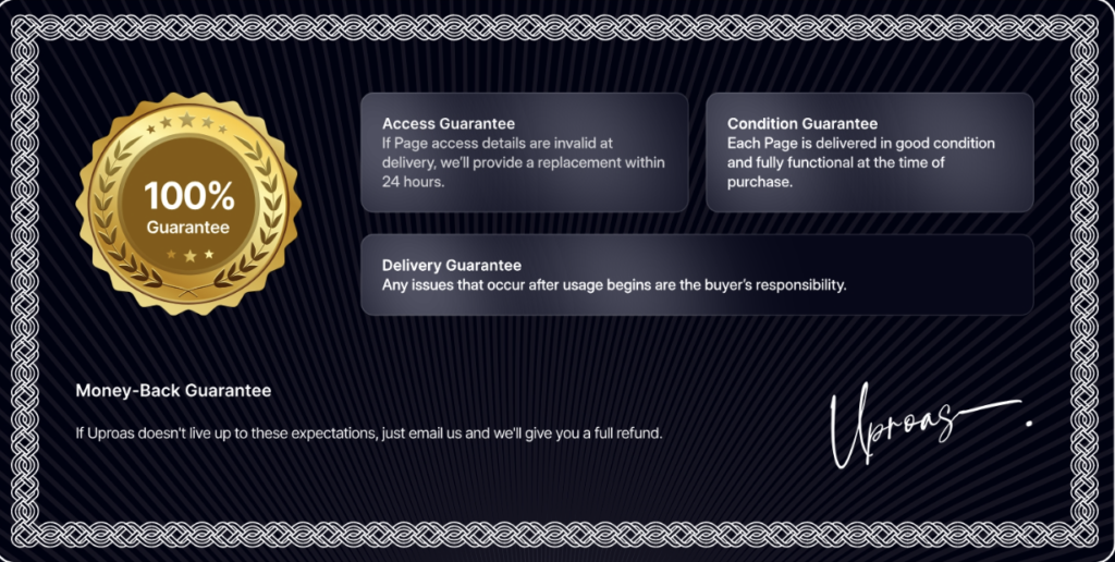
Uproas is a company that provides premium ad accounts on platforms like Meta, Google, and TikTok for agencies and media buyers. They tackle hesitation head-on on their Facebook Accounts landing page.
There, they prominently display a money-back and delivery guarantee, directly reassuring visitors that they’ll receive what they pay for.
Rather than leaving buyers to wonder about reliability or safety, Uproas answers those concerns before visitors even think to ask.
Highlight Use Cases to Help Buyers See Themselves Using the Product
Generic messaging asks visitors to do too much mental work. When someone lands on your page and can’t quickly picture how your product fits their specific situation, they default to assuming it probably doesn’t.
Use cases solve this by doing that work for them. They show visitors a version of themselves already using what you offer.
This matters especially in B2B, where buyers often need to justify a purchase to someone else. A use case gives them the language to do that. It connects your product to a recognizable problem, in a context that feels familiar.
Here’s how you can do this on your website:
- Segment use cases by role, industry, or goal – whichever dimension your buyers identify with most strongly.
- Lead each use case with the problem, not the feature. Start with what the buyer is experiencing, then show how your product addresses it.
- Keep them concrete. Vague use cases are just marketing copy with extra steps.
- Use real numbers and outcomes where possible. “Reduced onboarding time by 3 days” is a use case. “Improved efficiency” isn’t.
- Don’t overload the page. Three to five well-written use cases outperform a long list of shallow ones every time.
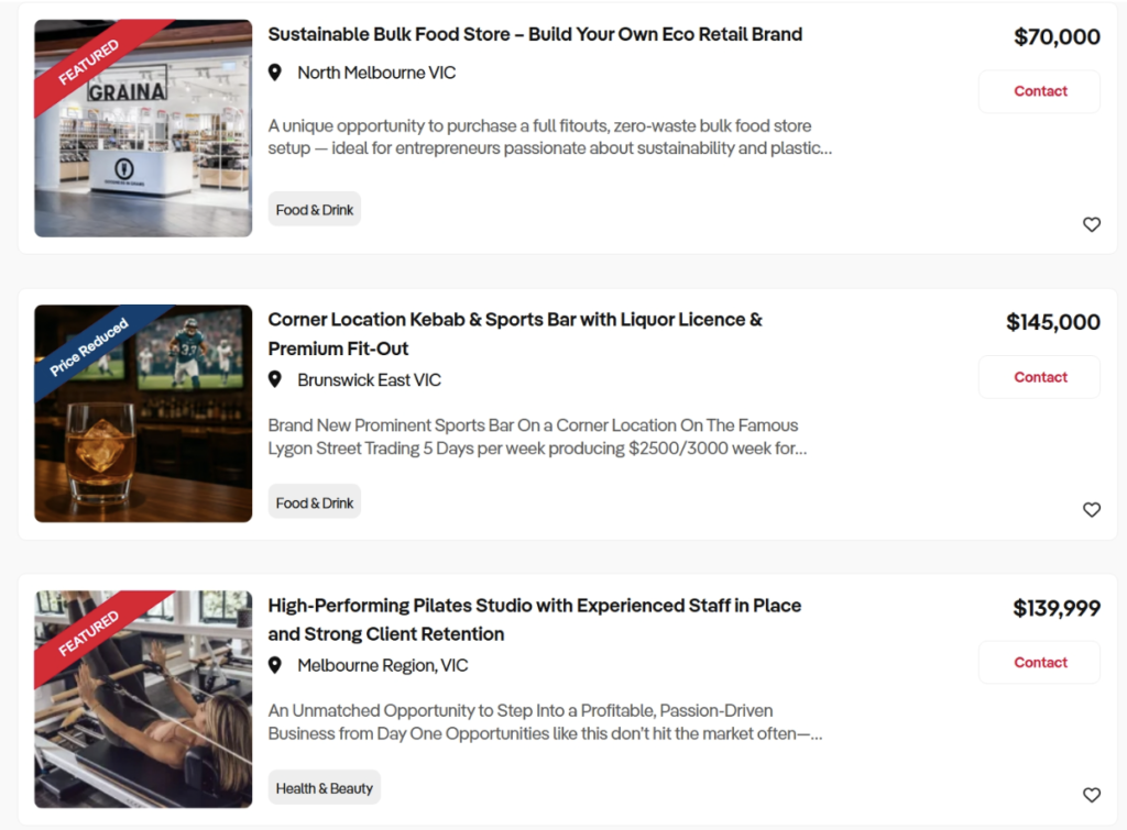
Business For Sale, an Australian platform connecting buyers with businesses available for acquisition, does this effectively on their Melbourne listings page.
Each listing describes the business in terms of scope, scale, and profitability, giving prospective buyers enough detail to picture themselves as owners.
Visitors aren’t left guessing about compatibility. The information lets them self-qualify quickly and focus on opportunities that actually match what they’re looking for.
Use Messaging to Guide Visitors Toward the Next Step
Most B2B websites tell visitors what they do, but forget to tell them what to do next. A visitor who’s interested but unsure where to go will often just leave rather than hunt for the next step themselves. Your messaging needs to carry them forward, not leave them to figure it out alone.
This connects directly to relevance. 72% of consumers say they only engage with marketing messages tailored to their interests.
That applies to CTAs just as much as headlines. A generic “Contact Us” button doesn’t speak to anyone specifically. A CTA that reflects exactly what a visitor was just reading feels like a natural next step rather than a sales push.
Here’s how you can do this on your website:
- Match your CTA language to the content surrounding it. If the section explains a specific service, the CTA should reference that service directly.
- Use action-oriented language that’s specific to the outcome, not just the action. “Get a Free Audit” beats “Submit” every time.
- Place CTAs where interest is highest, such as immediately after a value proposition, after a use case, or after social proof.
- Avoid using one catch-all CTA across an entire page. Different sections attract different visitors with different needs.
- Test CTA copy regularly. Small wording changes can produce meaningful differences in click-through rates.
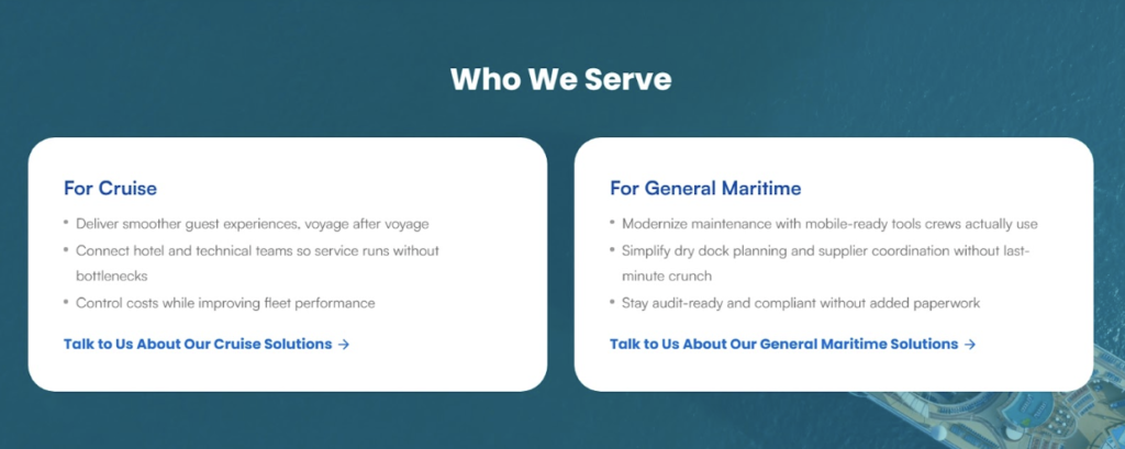
ITsynch, a software company serving the cruise and maritime industry with purpose-built operational management tools, uses this strategy throughout their site.
Rather than relying on a single generic CTA, they place targeted prompts within relevant sections. For instance, they use “Talk to Us About Our Cruise Solutions” and “Talk to Us About Our General Maritime Solutions” so each visitor gets a next step that matches exactly what they were just reading.
Use Data to Validate Your Claims
Anyone can write “our product saves you time” on a homepage. It costs nothing and proves nothing. Visitors have seen that kind of language enough times to scroll past it without registering it.
But “our product saves teams an average of 6 hours per week” is a different sentence entirely. It’s specific, it’s verifiable, and it gives the reader something concrete to hold onto.
Data works because it removes ambiguity. Instead of asking visitors to take your word for it, you’re giving them something measurable to evaluate. That switch, from assertion to evidence, is what moves skeptical buyers closer to a decision.
Here’s how you can do this on your website:
- Use data that connects directly to outcomes your buyers care about, not internal metrics that only matter to you.
- Keep stat callouts short. Use a single number and a single message. Don’t bury the figure in a paragraph.
- Cite your sources where relevant. Attributed data is more credible than data that appears out of thin air.
- Pair statistics with context when needed. A number without explanation can confuse more than it convinces.
- Prioritize user-generated data, like survey results, usage statistics, or customer outcomes, over industry averages that anyone could reference.
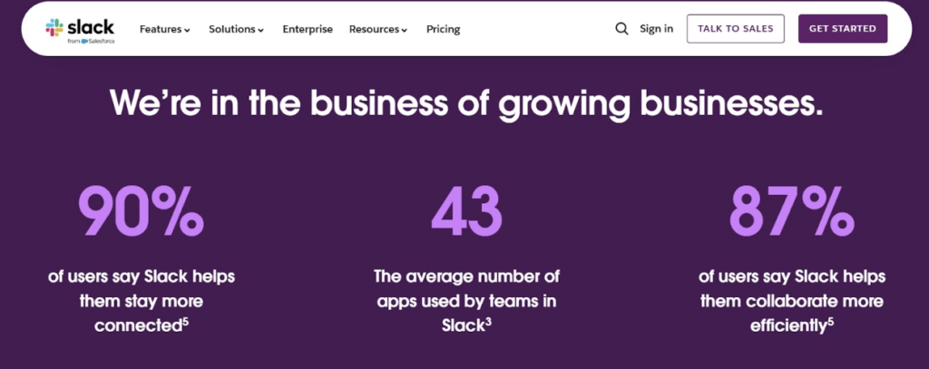
Slack, a workplace communication and productivity platform built around AI-powered collaboration, does this consistently on their homepage.
Rather than making broad promises, they back their claims with user data. Each claim is short and easy to grasp. A visitor scanning the page can absorb the proof immediately.
As a result, the benefits aren’t abstract anymore. They’re attached to real numbers from real people.
Final Thoughts
The tactics covered in this article focus on making messaging clarity visible across your entire site:
- A strong value proposition helps visitors understand your offer right away
- Social proof builds confidence through real customer experiences
- Addressing common concerns removes hesitation before it grows into doubt
- Use cases make your product easier to picture in real situations
- Targeted CTAs guide visitors forward
- Data-backed statements add credibility to your claims
These elements work best when they support the same message. Visitors should move through the page without guessing what the product offers or why it matters.
So, take a fresh look at your own site. Find the places where you’re making visitors work too hard to understand you. Fix those first. Then layer in the rest. Your conversion rates will follow.